California Department of Motor Vehicles (DMV) redesign
I’d consider myself a “user” since I lived in the San Francisco Bay area for the past 8 years. As a result, I have several encounters per year with DMV in various capacities, and on various tasks. This requires me to use their website quite often. While their recent redesign is a step in the right direction, the system still suffers many areas where experience could be greatly improved…

The point of this redesign was to achieve maximum impact, with minimal changes. I happen to know Bootstrap – the front-end framework upon which DMV is build on – so all of these changes took me no more than 5-10 minutes to not only “design”, but also to code.
I greatly simplified the copy, which was perhaps the most important part of this undertaking – a similar approach that I took to redesign COPPA forms for Autodesk.
Appointments landing page redesign
The Appointments landing page serves as a first step in the process. While this landing page could be improved even further (is there really a need for one?), the step I found more interesting and worthy of improvement was the appointment sign up form itself.
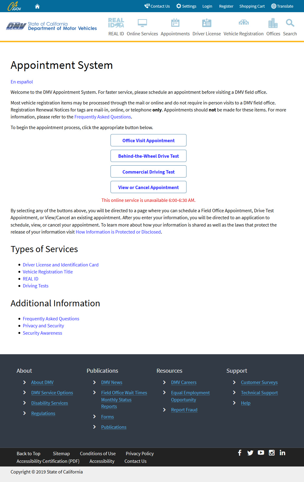
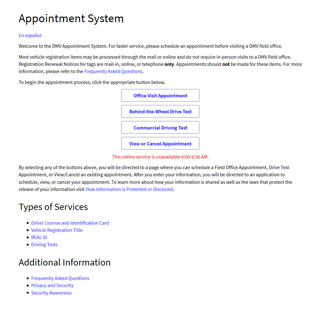
Before
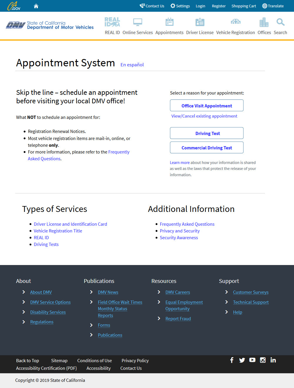
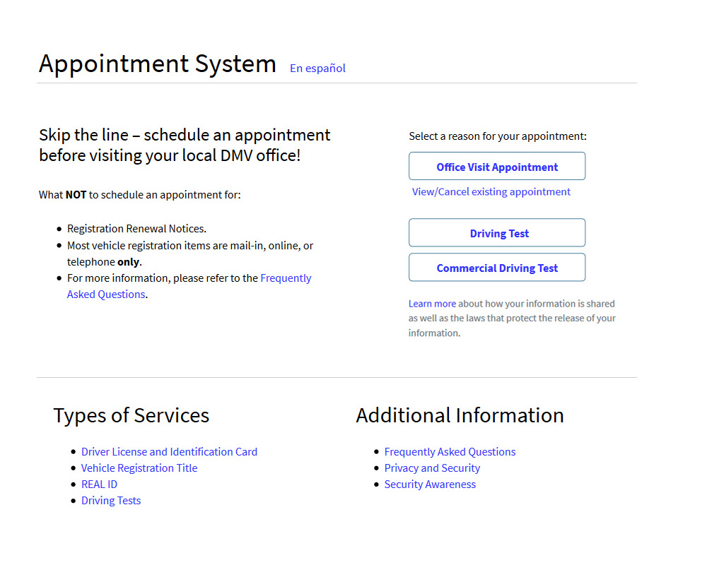
After
Above illustrates how small changes can make a big difference, when common sense-approach and user [centered] thinking are applied.
Before

After

- Title is OK, but there is absolutely no need to take away from valuable screen real estate by dedicating an entire line to Spanish version link…
- To turn the title into a more prominent "anchoring" element of the page, I've used an existing Bootstrap class to add an underline to this page heading.
Before
After
- People do not read long lines of text.
- Without any content architecture everything becomes of the same weight.
- People react better to short bullet point lists.
- Focus on only one main idea, and make it stand out.
- Be upfront in your language by getting straight-to-the-point.
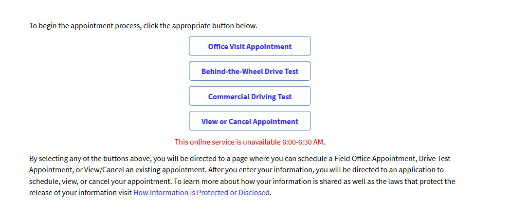
Before
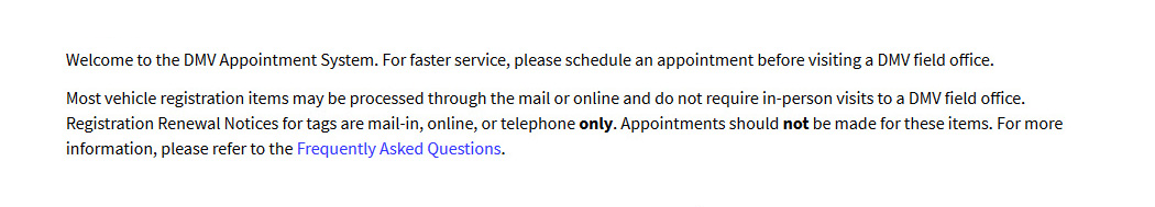
“Appointment System
Welcome to the DMV Appointment System. For faster service, please schedule an appointment before visiting a DMV field office.”
- Avoid repetition in language as much as possible.
- There is no need to "welcome" anyone to the page - this isn't 1990…
- Why beg by saying "please" if scheduling an appointment is in user's own interest?
- Field office? This sounds like a WWII documentary…
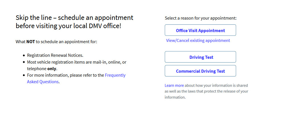
After
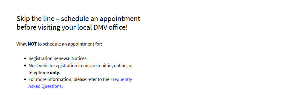
“Appointment System
Skip the line – schedule an appointment before visiting your local DMV office!”
- Be more direct. Don't waste users' time with unnecessary 'talk'.
- Concentrate all the attention on the main pain-point of saving time via skipping the line.
- Use common, simple-to-understand and relate to language, and for goodness sakes, make your copy sound less rigid by adding some exclamation.
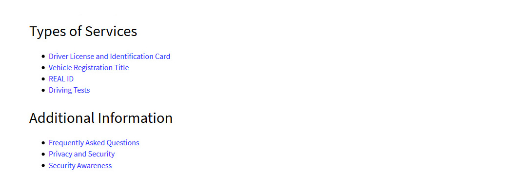
Before
After
- Here's a key take-away here: anything that requires a manual (or a description in this case), is too complex to understand, and should be reworked until it requires no such manual or description.
- "View or Cancel Appointment" also didn't belong in the same stylistic group as the other 3 CTAs since it is a modifier of the main event.
Before
After
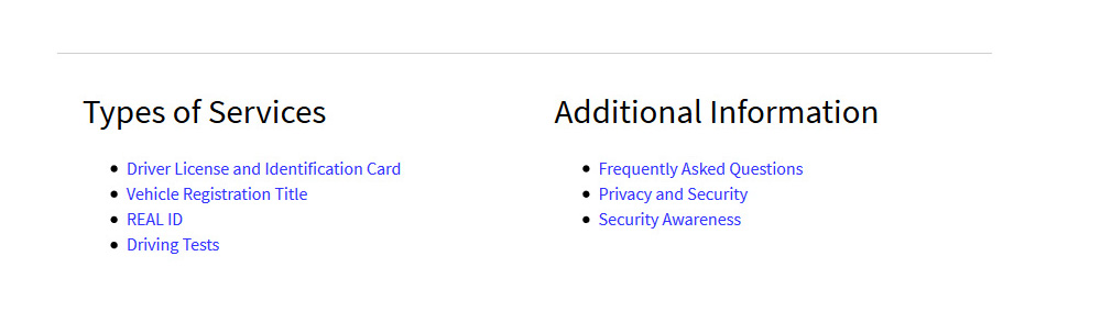
- Whenever you have the ability to utilize existing white space on such a landing page [on larger screen sizes], DO IT! Subconsciously users will thank you for not making them do the extra scrolling!
- I have added a horizontal rule in order to create a logical visual separation from the CTA section.
Before
After
Appointments form redesign
The only point of this entire process is to get an appointment. This should be done quickly, since it would go along nicely with the whole reason as to why you'd set up an appointment in the first place – so you could avoid a 2-hour line (and I'm not exaggerating). So it is with concept of efficiency and time-savings in mind is how I approached the following redesign.
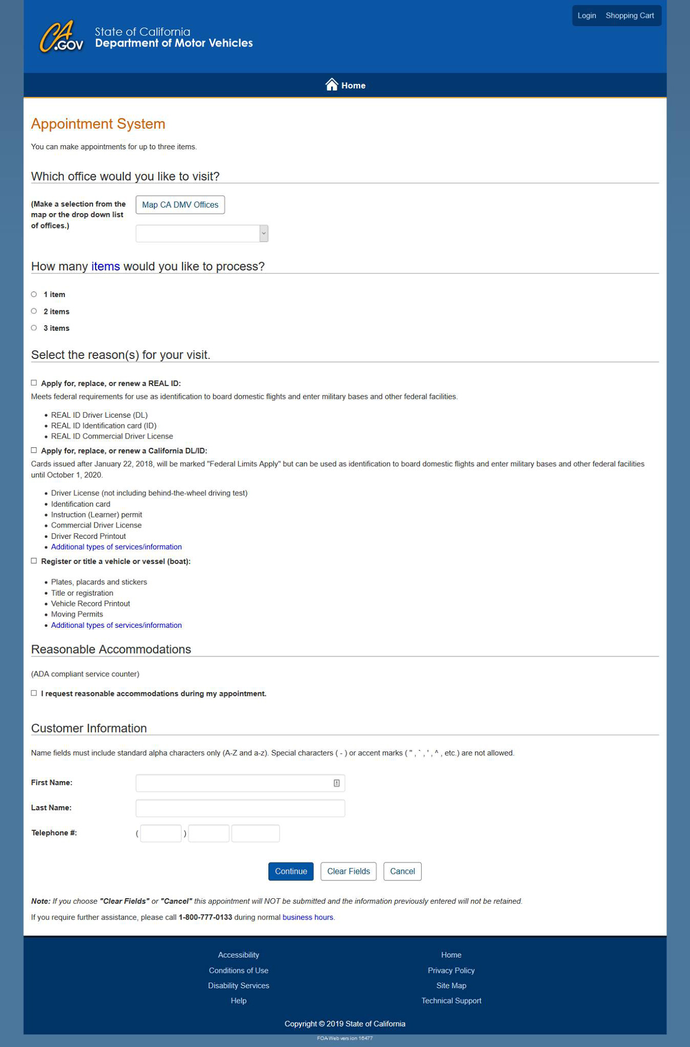
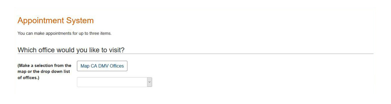
Before
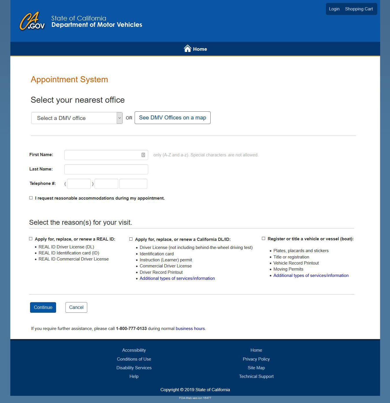
After
Before
After
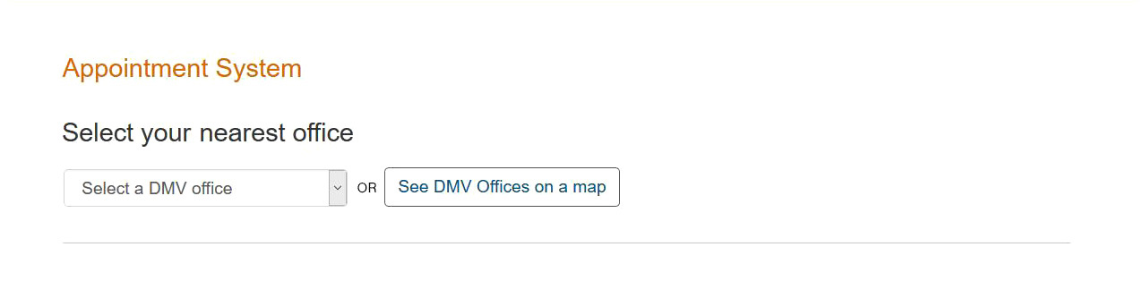
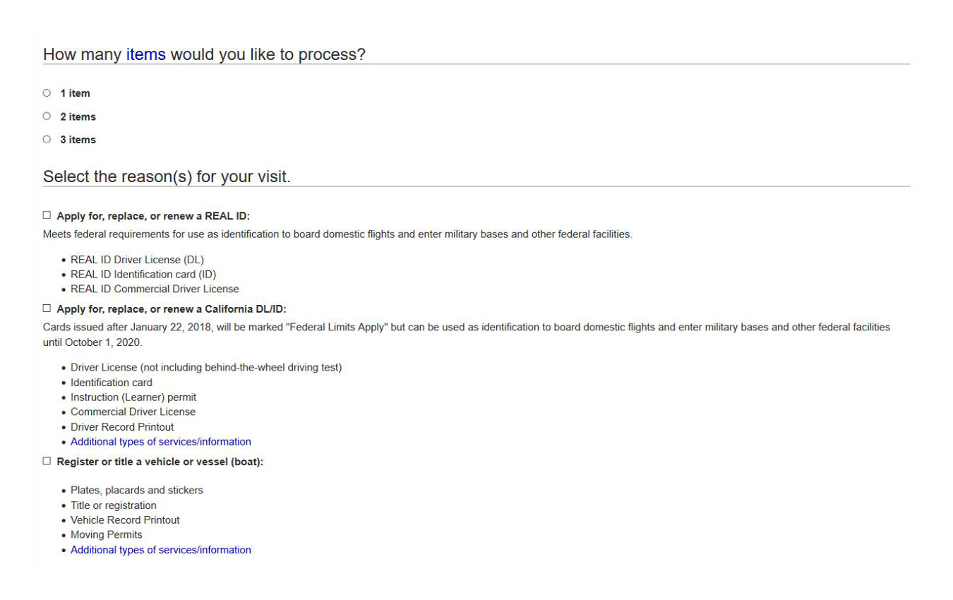
- Why take six lines, when you can achieve the same in three?
- Why even mention the number of "items" you can make appointments for – if you have an entire section dedicated to only three options directly below anyways? Mildly put, this is redundant…
- Why create a description of an empty selector field instead of putting it inside of the selector itself? This is HTML 101.
- Furthermore, these two options should be given equal weight by putting them side-by-side whenever possible.
- P.S. Old page had too many Horizontal Rules in all the wrong places. Reduce amount by positioning them more strategically (as a result I've eliminated 2 of them).
Before
After
- There is no need for titles in this case as information is self-descriptive. Who else's First and Last Names, will the user be entering?
- The second most important bit of information after office selection, is personal information. (And not "item" selection.)
- Remember, before you simplify your internal life, simplify the external one for your users. As such, I have moved user information before reason for visit, which is really just a way for DMV to 'route/classify inquiries/appointments'…
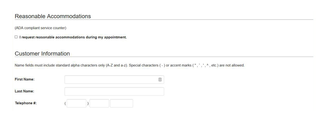
Before
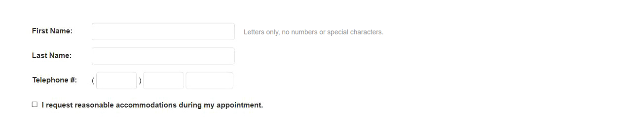
After
Where do I even begin… I know where people responsible for this interface should begin – they should begin by reading Skin in the Game by Nassim Nicholas Taleb.
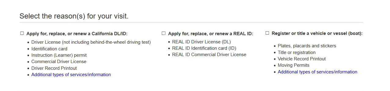
- The ridiculous "item" notion within this form should just completely be killed off. Let the user's action [of selection] serve as the number of items they wish to see you for – what a ridiculous "thing"! Again, it is SO BAD, they actually had to dedicate an entire section of Frequently Asked Questions, just to describe this "concept". ELIMINATE!
- Further [redundant text] simplification and content architecture gave each one equal weight, which made it easier to see and compare selections (Marketing 101).
Before

After
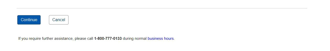
- Form is left-aligned, so it would make sense to keep CTAs consistent as well so you are eliminating unnecessary horizontal eye movement.
- Why use three buttons (two of which serve the same function), when you can get away with only two? Can someone say choice paralysis?
- Horizontal Rule was added as a logical conclusion to the form.
- …And again with descriptions; this only screams 'complexity'. Remove one choice, and description becomes redundant.
Enjoyed what you saw? Stay updated by following me.