Simple CSS techniques that add extra detail to your website
In this article I will go over some simple CSS techniques that add that ‘extra touch’ to virtually any website. These CSS properties are compatible with most modern browsers and are easy to implement. There are many ways you can style these, so please don't be limited by some of the examples that I provide. Comment and let me know if these are helpful to you and show off your work where you have used these!
text-shadow: (the drop shadow example)
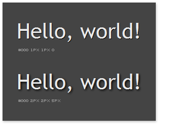
text-shadow property is fairly self-explanatory. It creates a shadow under your specified text. Example here shows this element creating a small shadow with a 1px offset on both x and y axis and another one with a 2px offset on both axis as well as 5px shadow "blur".
h1 {

                    text-shadow: #000 1px 1px 0;

                    background-color: #444;

                    }
Property values:
- Color, which in this case is plain black (#000)
- X-axis offset (1px)
- Y-axis offset (1px)
- Shadow blur (0). The higher the blur value, the more your shadow will be – you guessed it – blurry.
Best practices:
- Try to keep the blur value to a minimum because it can create some hideous looking results, unless used over an image.
- Try to apply the shadow to elements with little text, such as headings. If you start applying the shadow property to elements with a lot of text, the text can become very difficult to read.
- The shadow property works best on darker backgrounds. If you end up applying it to the text on brighter backgrounds, ensure that your shadow color is set to that of the background color (only a little bit darker obviously). Unless, of course, you use transparency:
rgba (0,0,0,0.15)– this means you are using black color @ 15% opacity. - The whole idea behind adding small details to your website is to not make them too obvious. People who are detail oriented will appreciate them, most, however, won't notice much. Keep your effects to a minimum and don't over-use them.
text-shadow: deboss example
Alternatively, text-shadow property can be used to create a pretty neat "deboss" effect. Instead of using a darker value for your shadow, use a brighter one. It should be brighter than your background color in this case, otherwise the effect won't be visible.
h1 {

                    text-shadow: #B1B1B1 1px 1px 0;

                    background-color: #999;

                    }
Best practices:
- This effect should be used on darker backgrounds.
Rounded corners
In case your design has room for things like rounded corners on pretty much any CSS element that supports borders, then this is for you. Add the following code to get a 2px radius on all four cornersof text fields and button.
div {

										border-radius: 2px;

                    -moz-border-radius: 2px;

                    -webkit-border-radius: 2px;

                    -opera-border-radius: 2px;

                    }
CSS transparency
Another great trick that can be achieved by using only CSS. You may apply transparency to any HTML element. The code below will apply 50% opacity to whatever element you specify.
div {

                    filter: alpha(opacity=50);

                    opacity: 0.5;

                    -moz-opacity: 0.5;

                    }
Enjoyed what you saw? Stay updated by following me.