Redesigning Bluewolf, an IBM company.
It’s not every day that you get a chance to improve something truly legendary, so when this one landed in my inbox, I jumped on it without any hesitation!
Thanks to the valuable insight, a rockstar team, and a roster of important connections, in 2016 IBM decided to buy out Bluewolf for $200M – one of the largest service agency acquisitions to happen in recent history.
The problem
Post-acquisition – once rebranded and rebuilt on Drupal1, by a non-Drupal-expert agency Butchershop (what a name…) – Bluewolf's website was left to grow, up until this growth started being problematic.
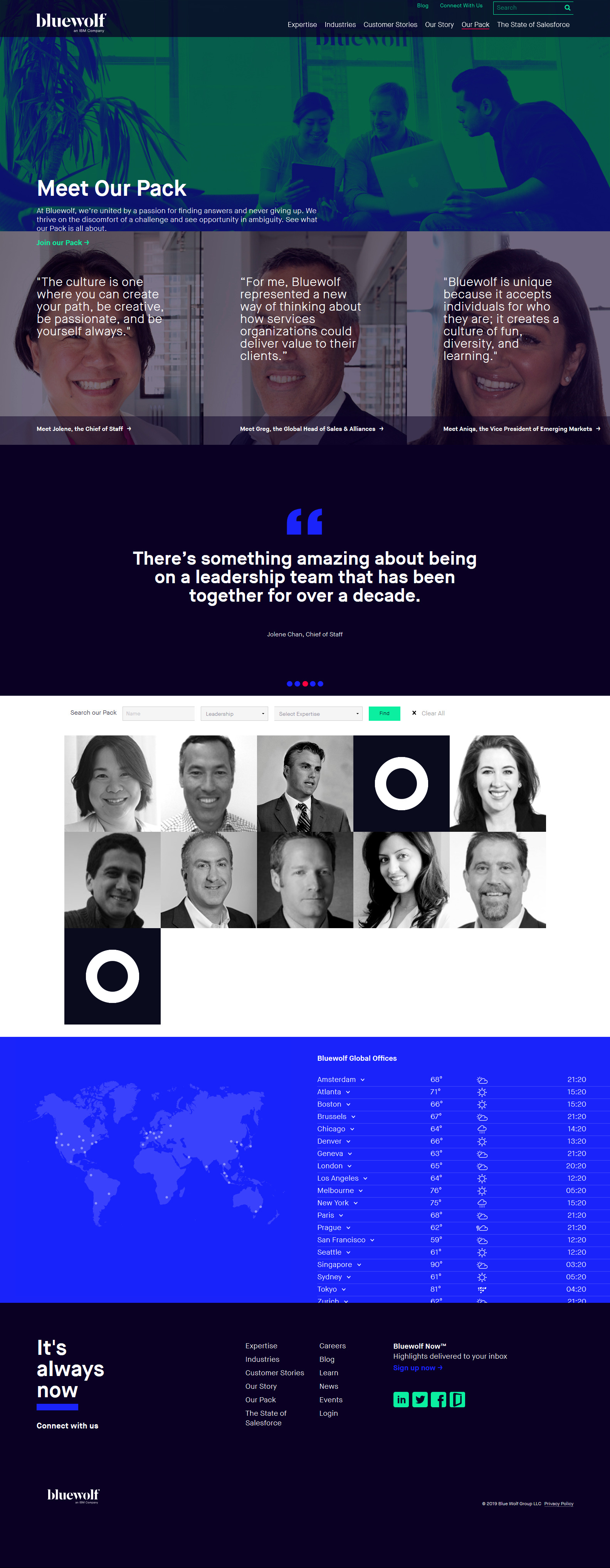
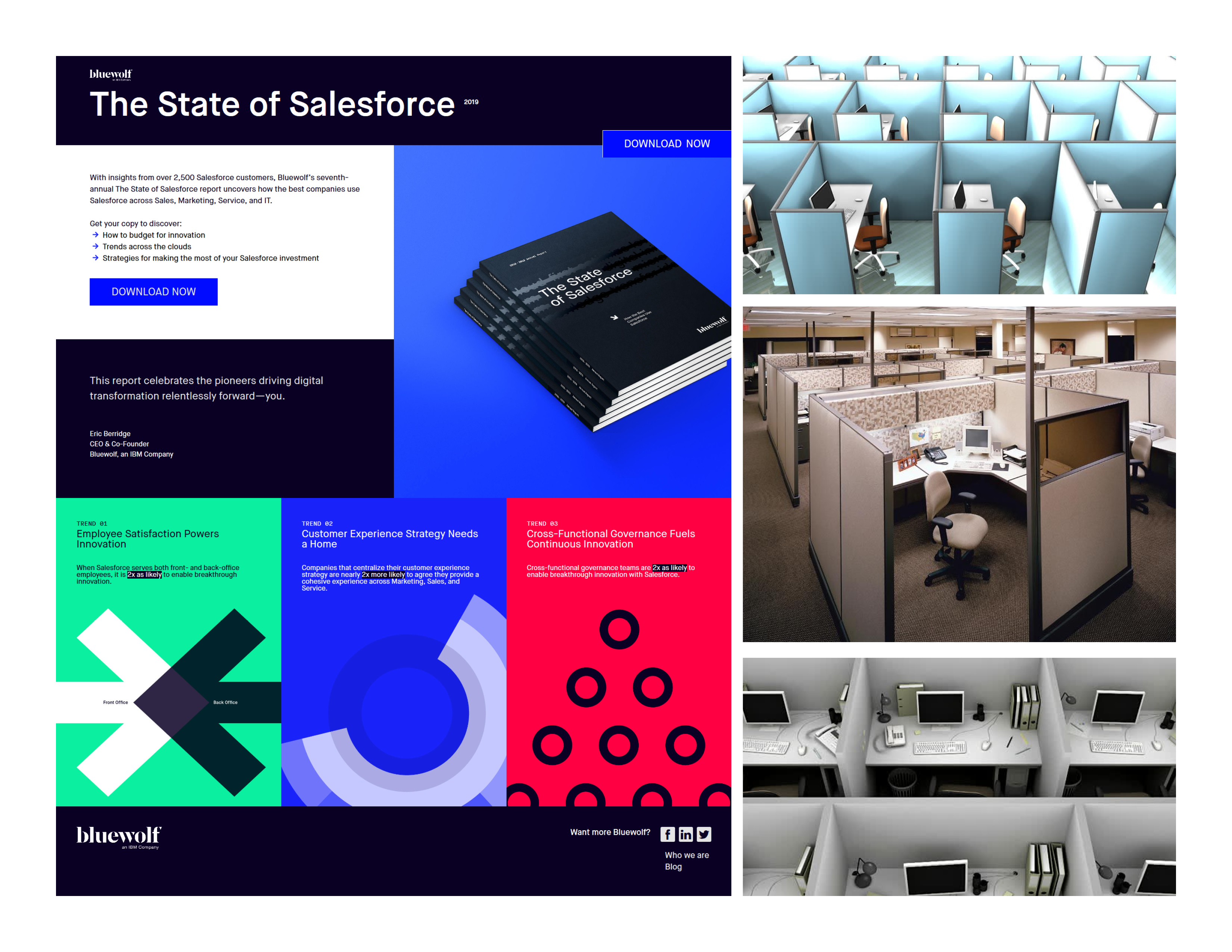
Bluewolf.com before redesign: Index, Industries, People.
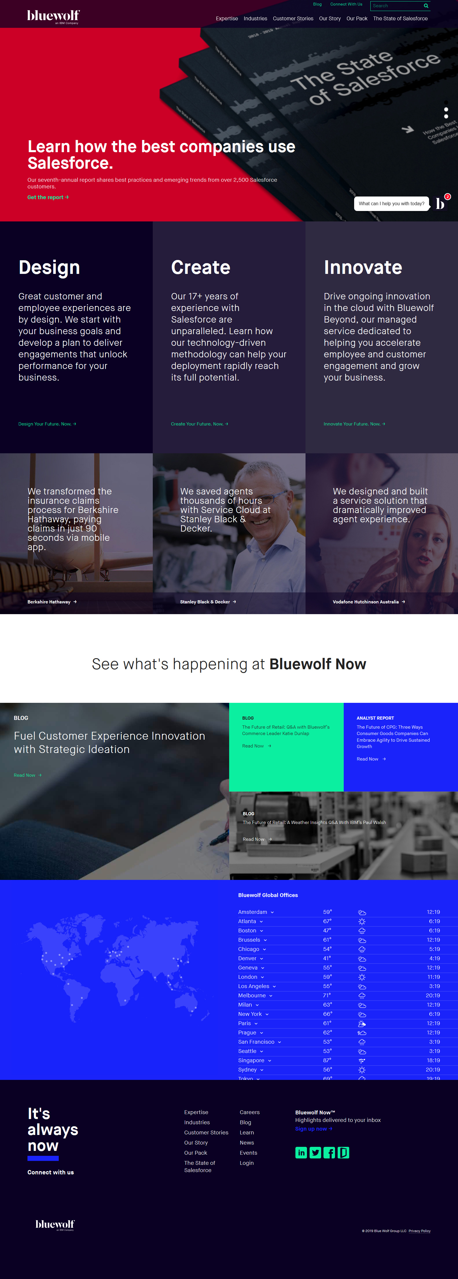
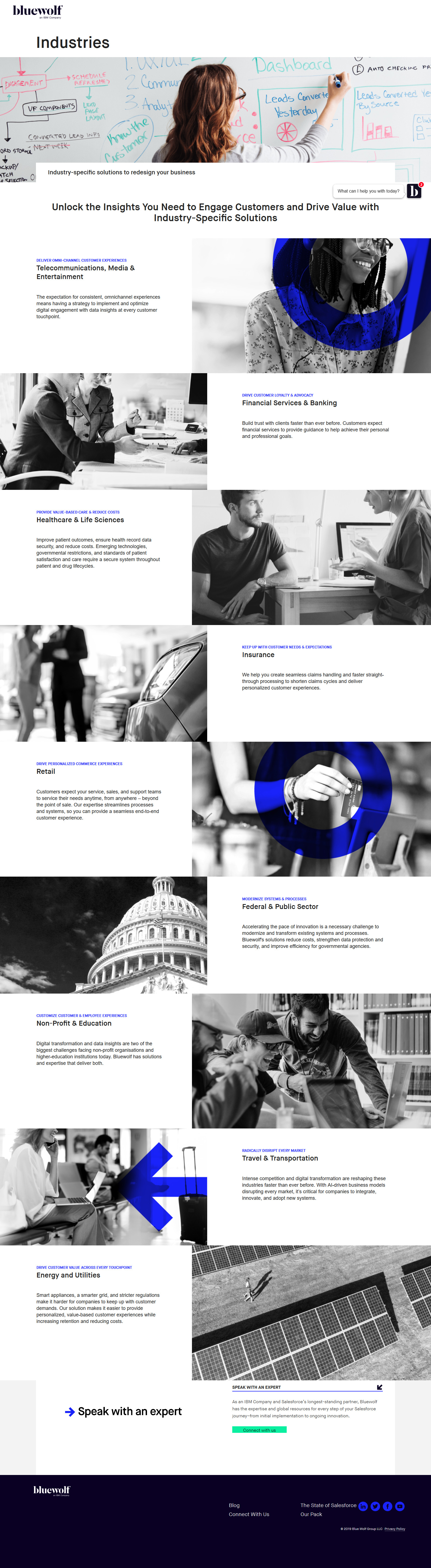
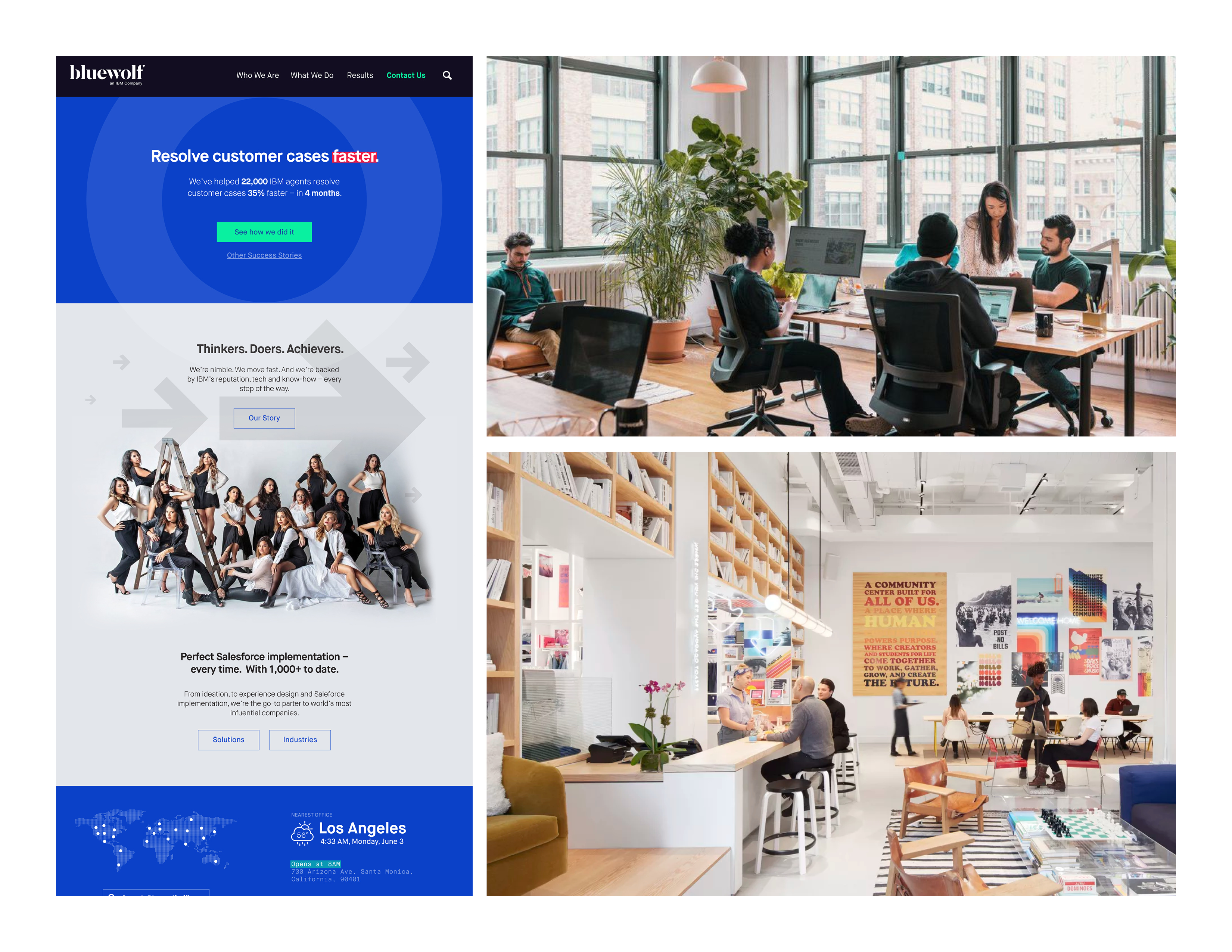
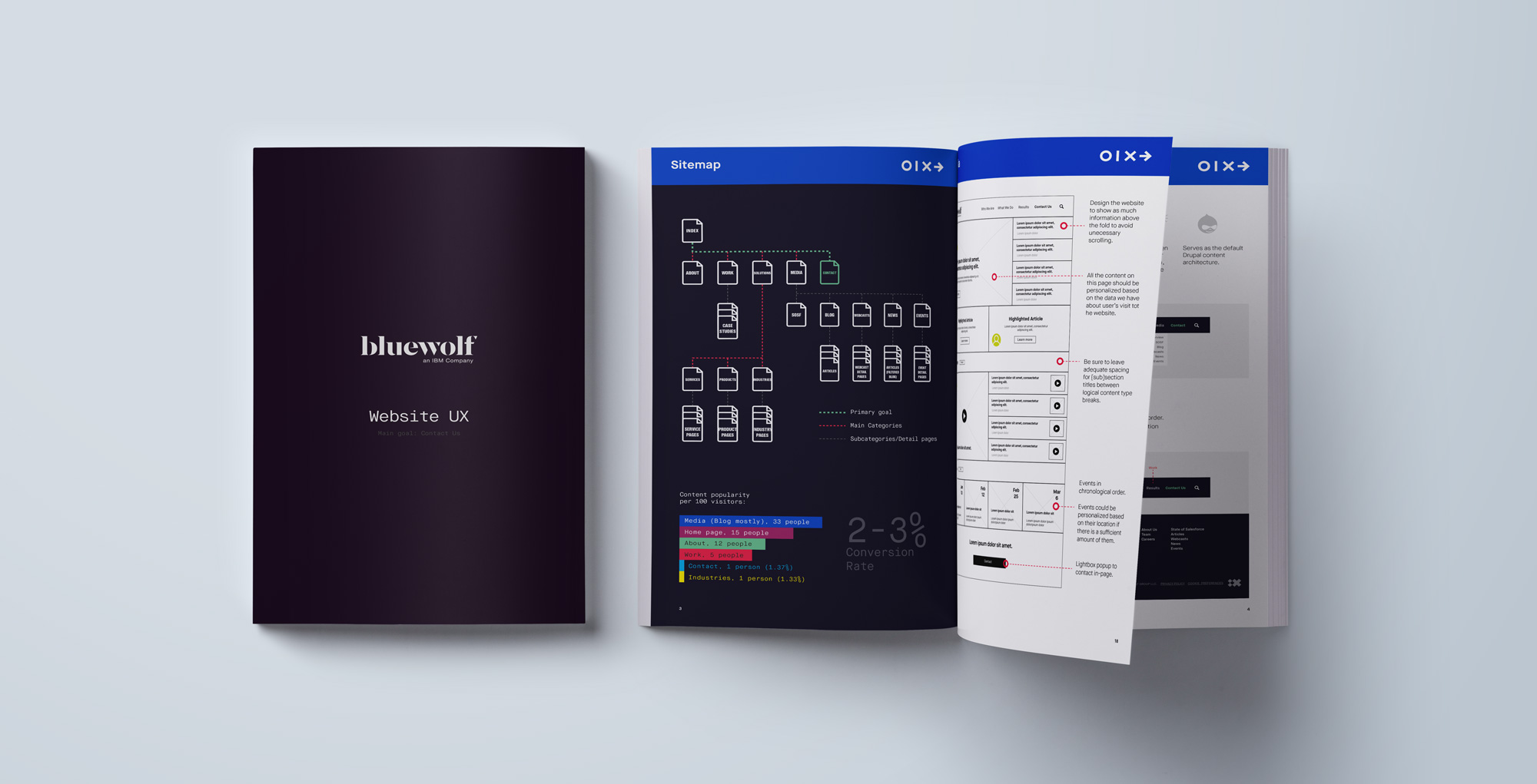
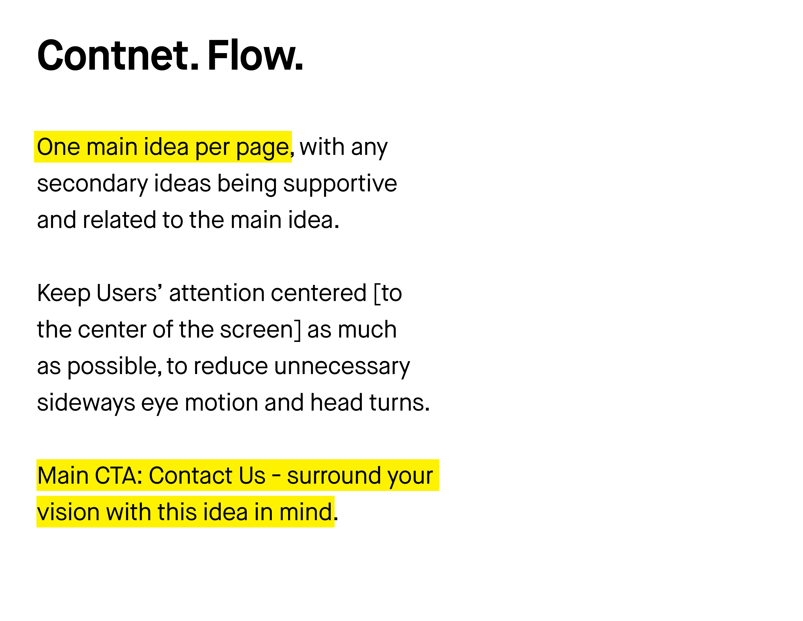
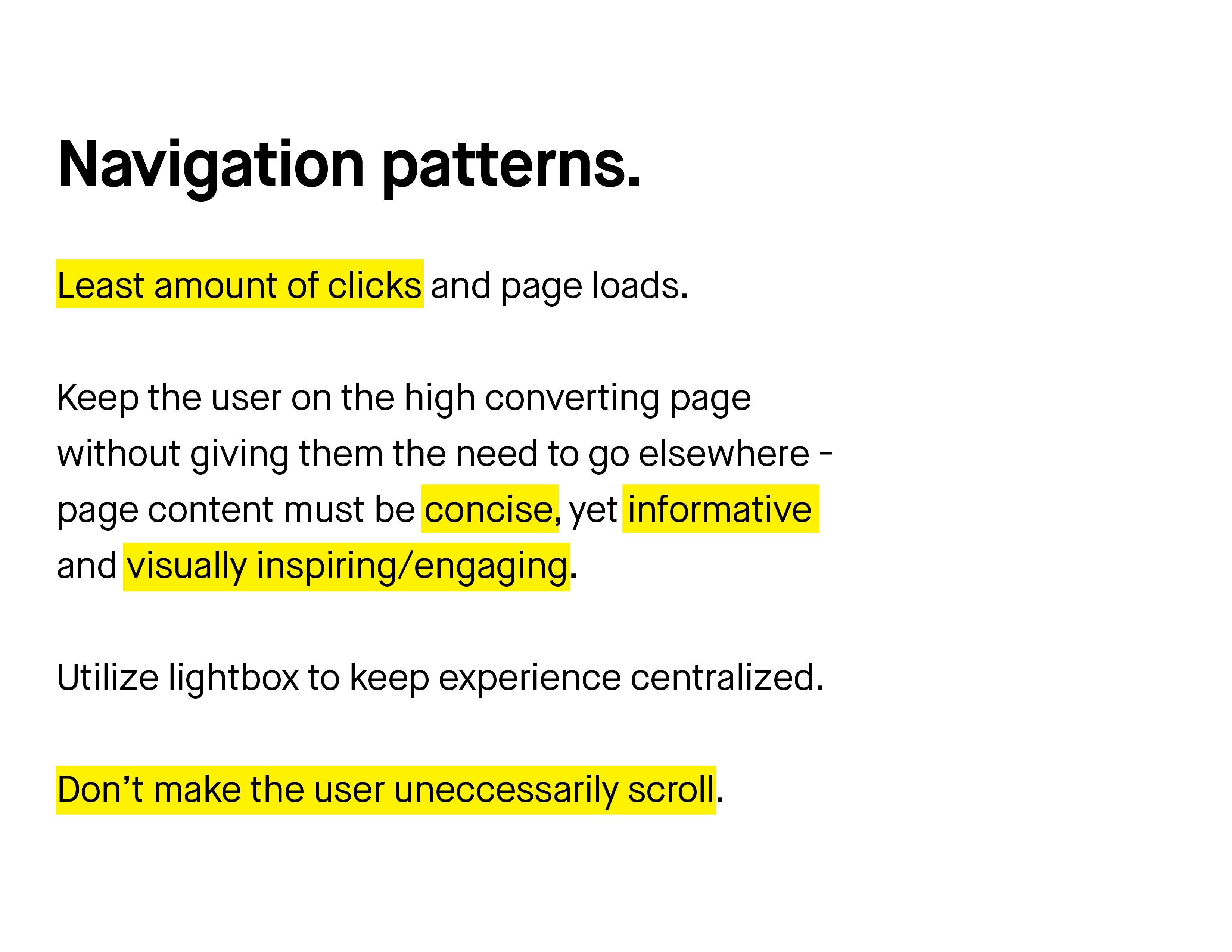
Previous website tried to answer too many questions and focused on too many things at the same time, resulting in the dilution of conversion rate. New website was designed strategically to answer only the questions that users need answered, and the rest of the "sale" was to be done after they get in touch with internal Bluewolf representatives.
Website became an 'open door' through which users could very quickly enter Bluewolf, instead of going through mazes of hallways in hopes to find answers to their questions.
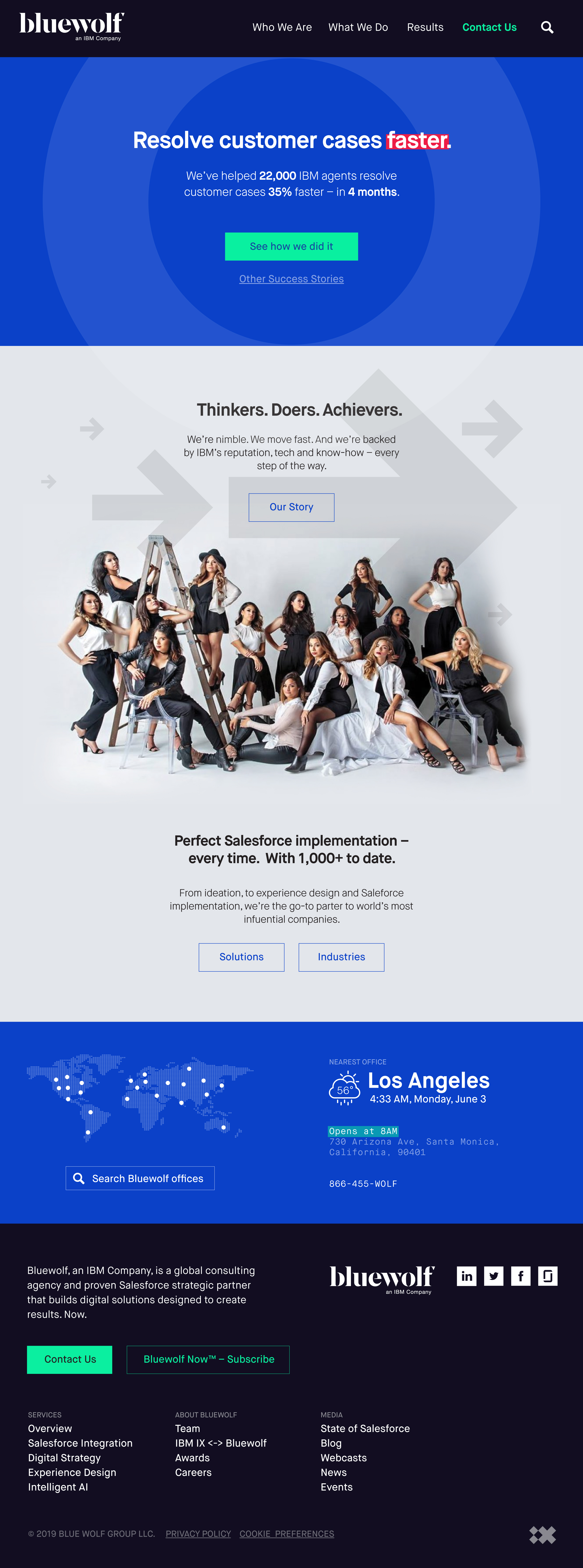
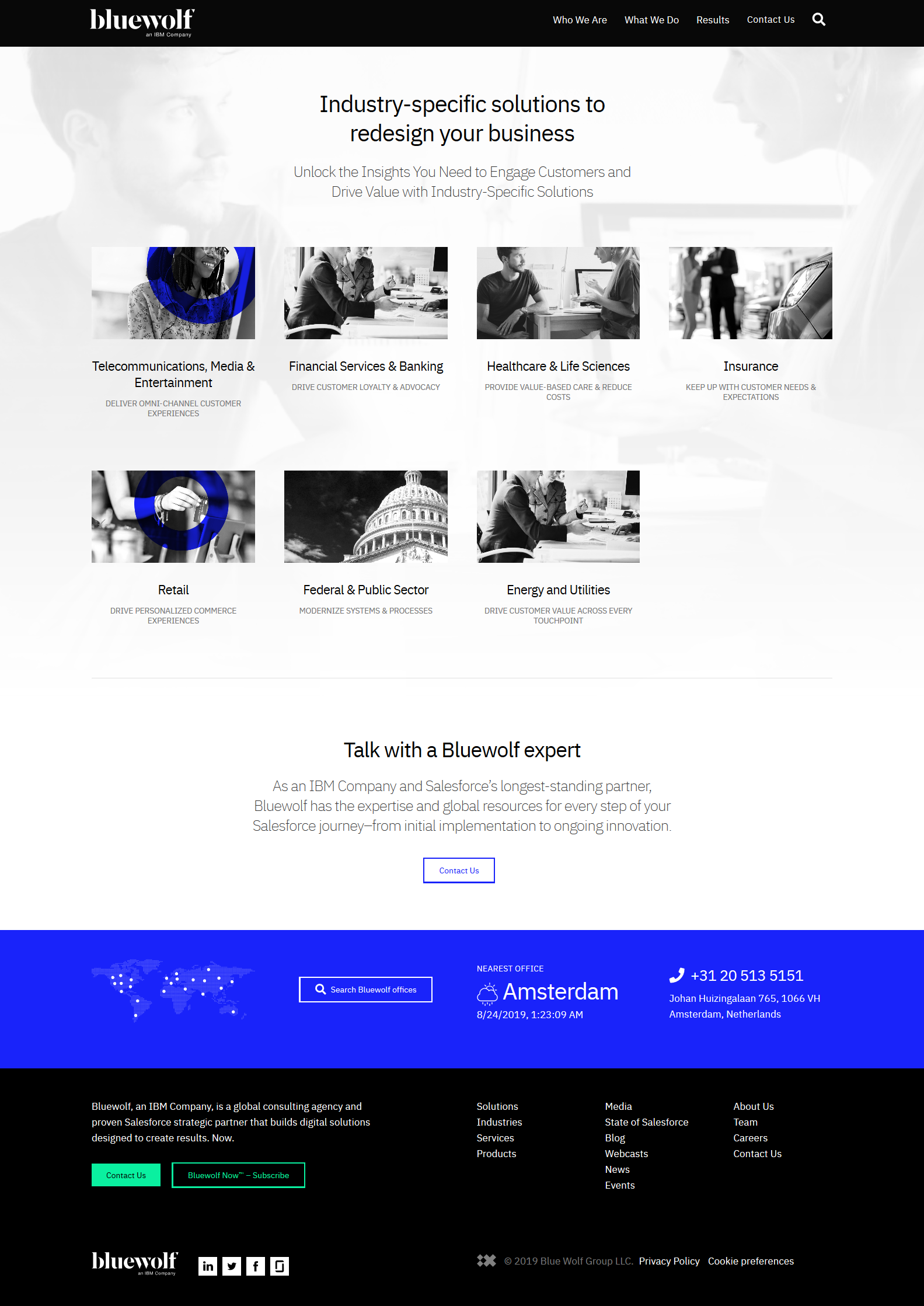
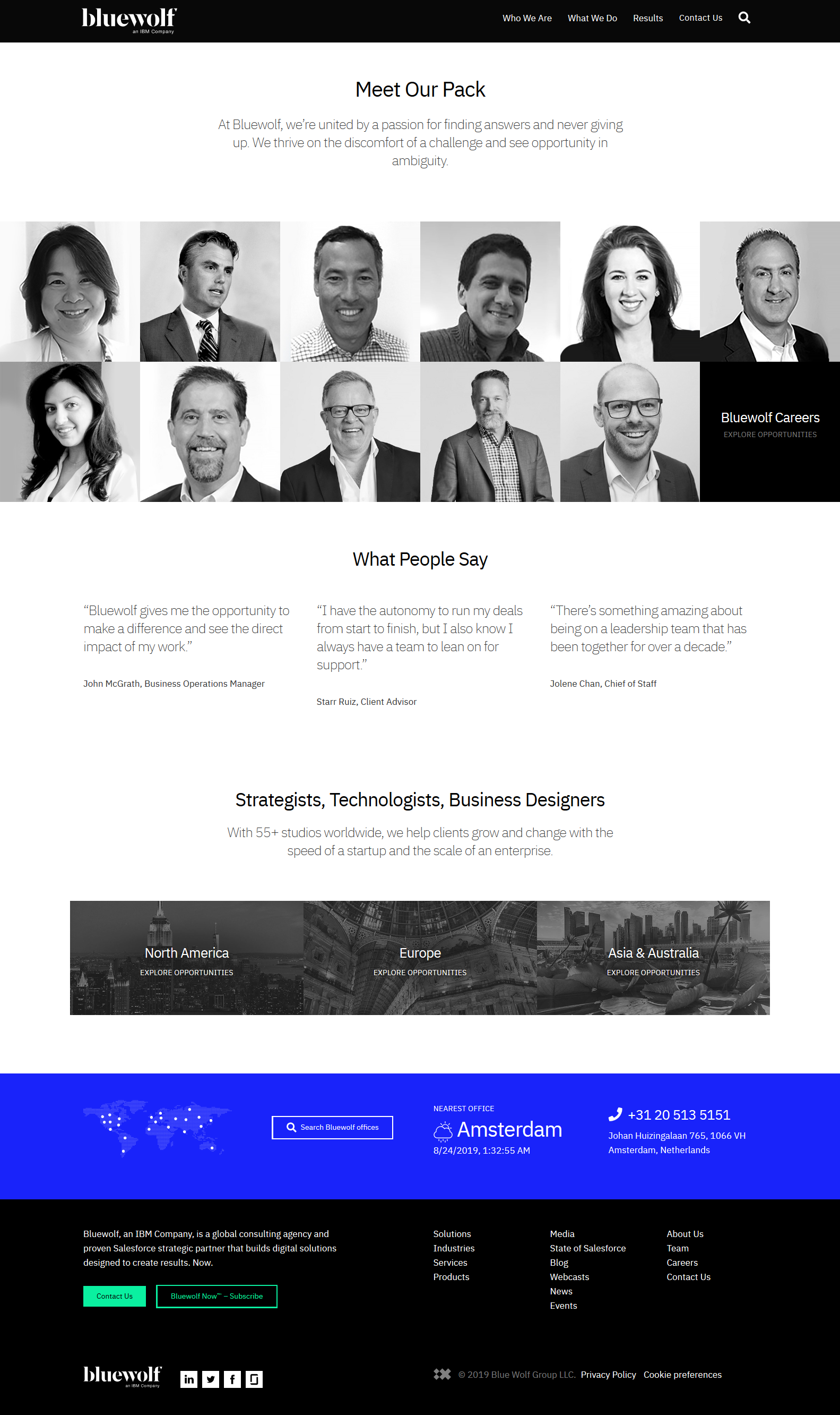
Bluewolf.com after redesign: Index, Industries, People.
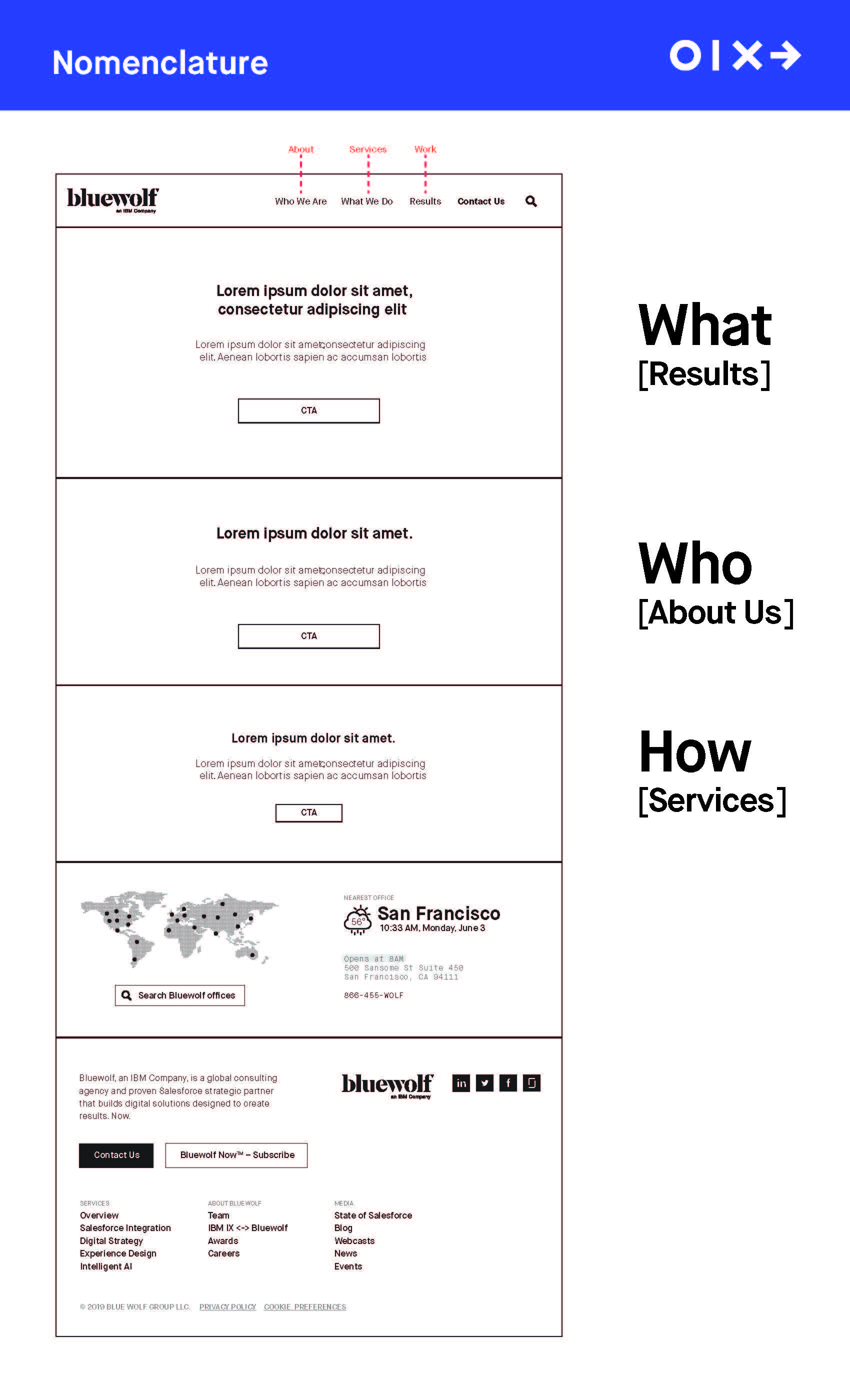
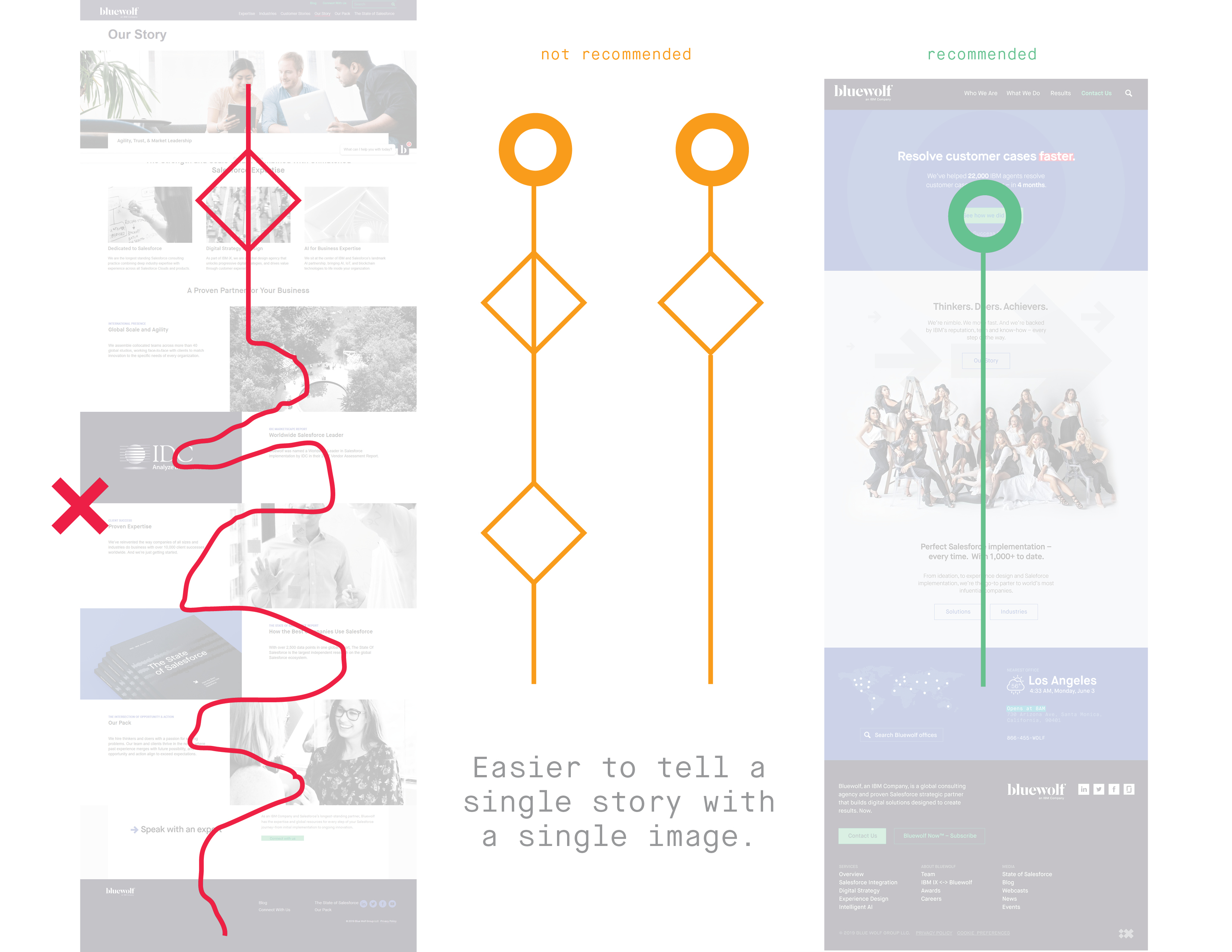
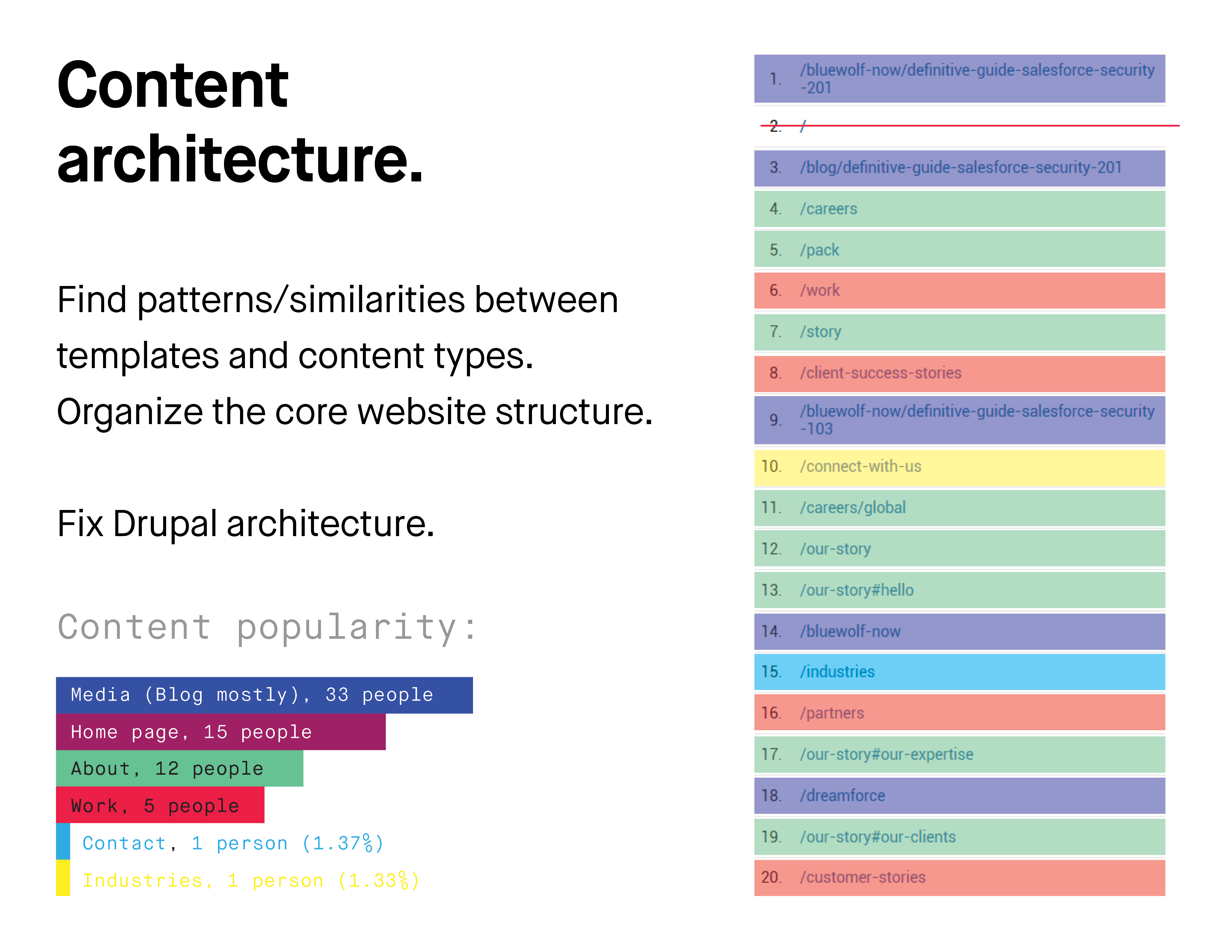
Overtime, because of its setup and build quality, the system got extremely 'bloated'. When I was introduced to the website, it consisted of:
- over 30 different, yet, in many ways, very similar templates, blocks, navigations, and footers.
- It had 4 different footer treatments,
- templates with missing navigation,
- inconsistent structure and content architecture throughout the website.
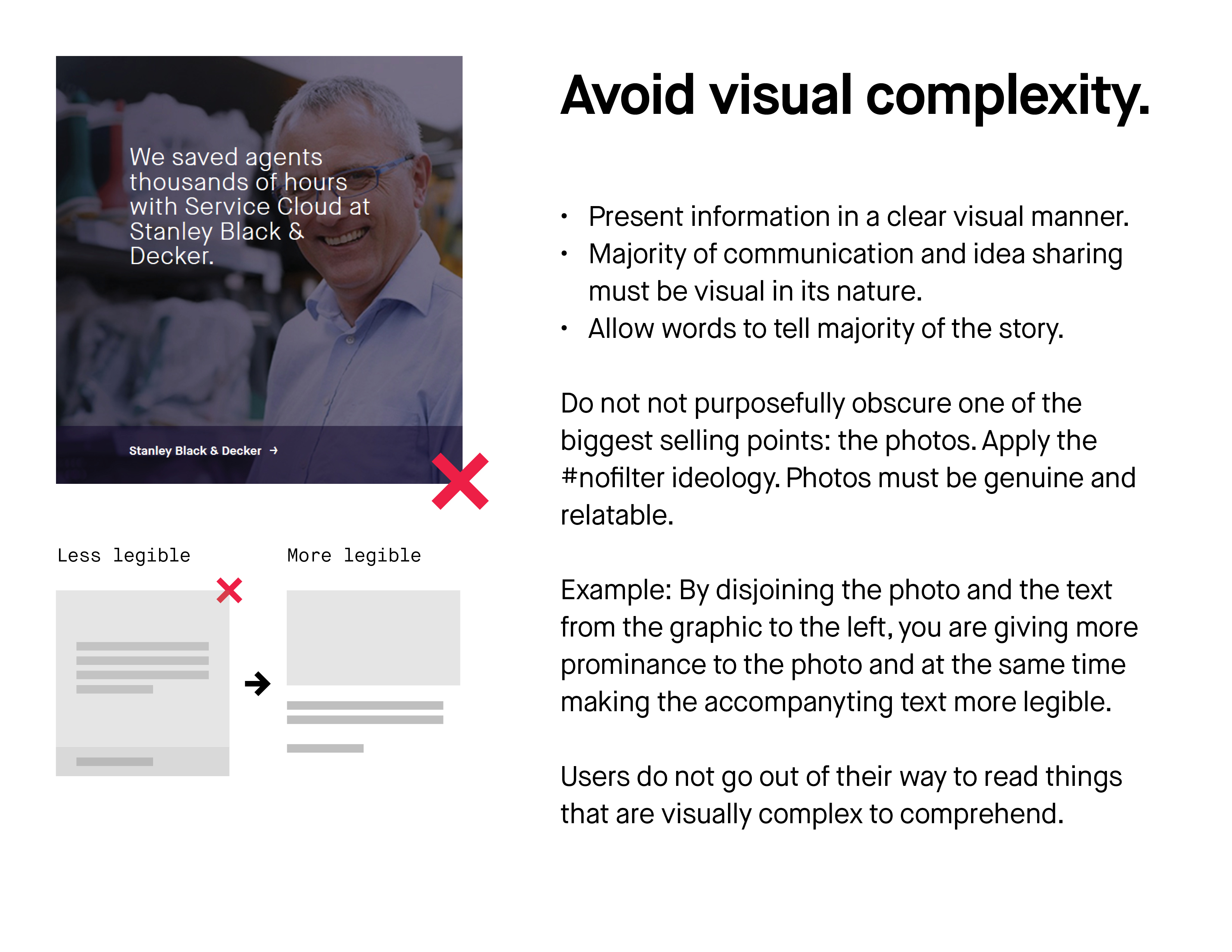
- The unoptimized, sub-par codebase (I'm all about simple decisions and therefore simple, clean code) was impossible to update, it was slow to run, heavy to load and caused Bluewolf massive issues with SEO efforts, putting pressure on their user acquisition, and in turn, on their marketing team.
- In majority of cases, unoptimized graphics were tripling the bandwidth load, creating for a poor mobile experience.
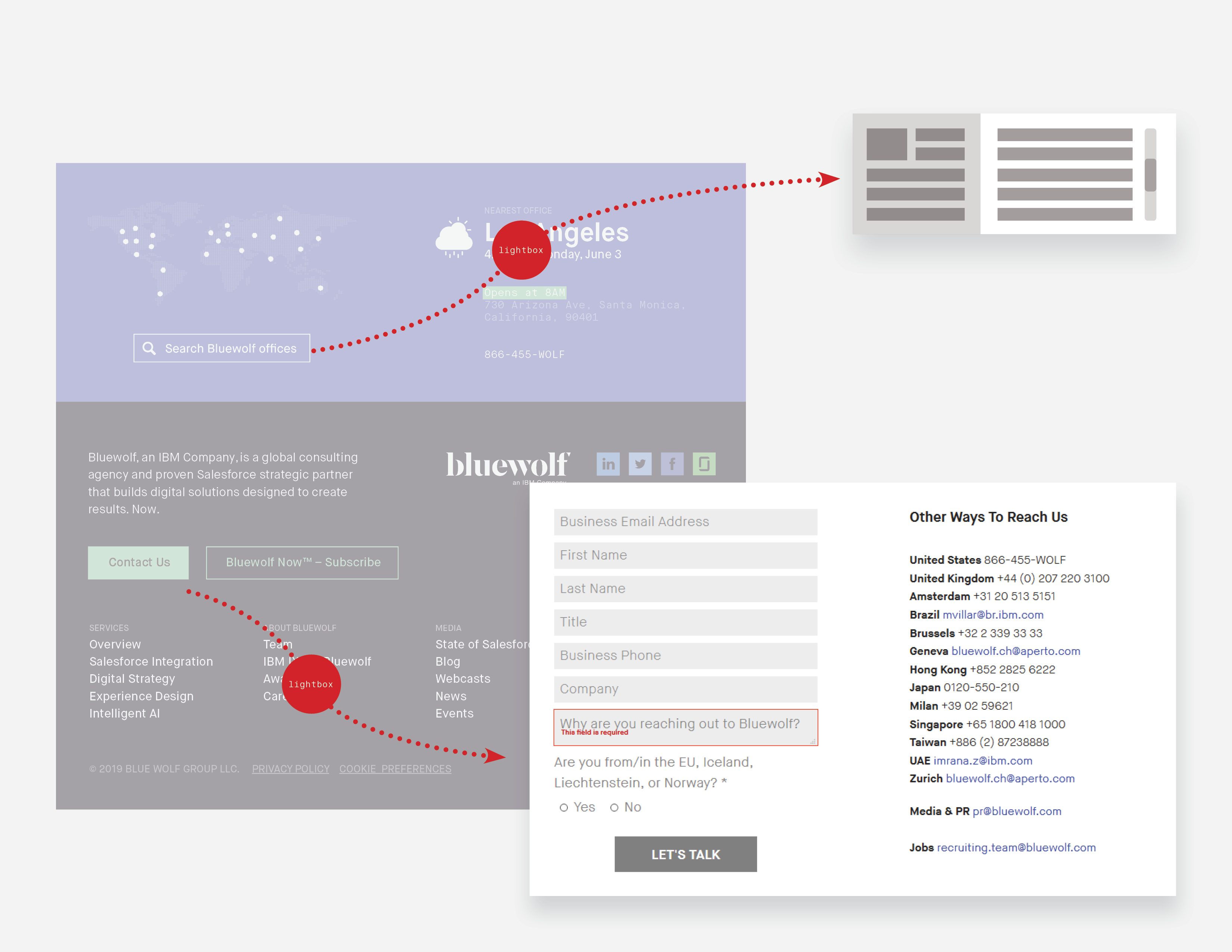
- Dead ends due to missing main and/or secondary navigation on many of the templates have been causing users to get lost, let alone to convert.
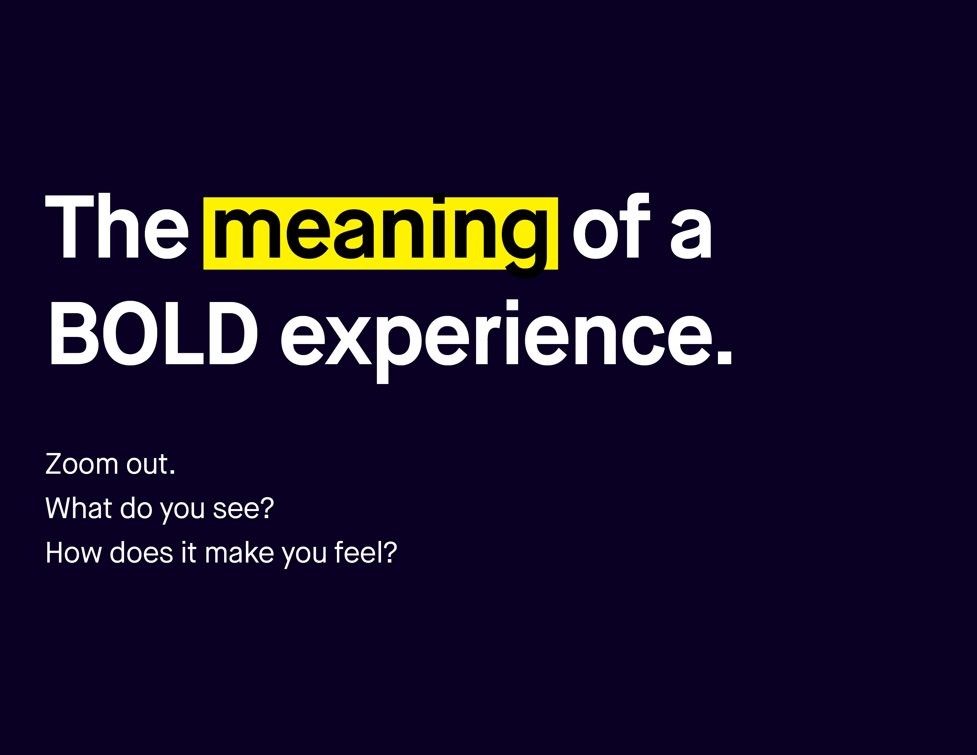
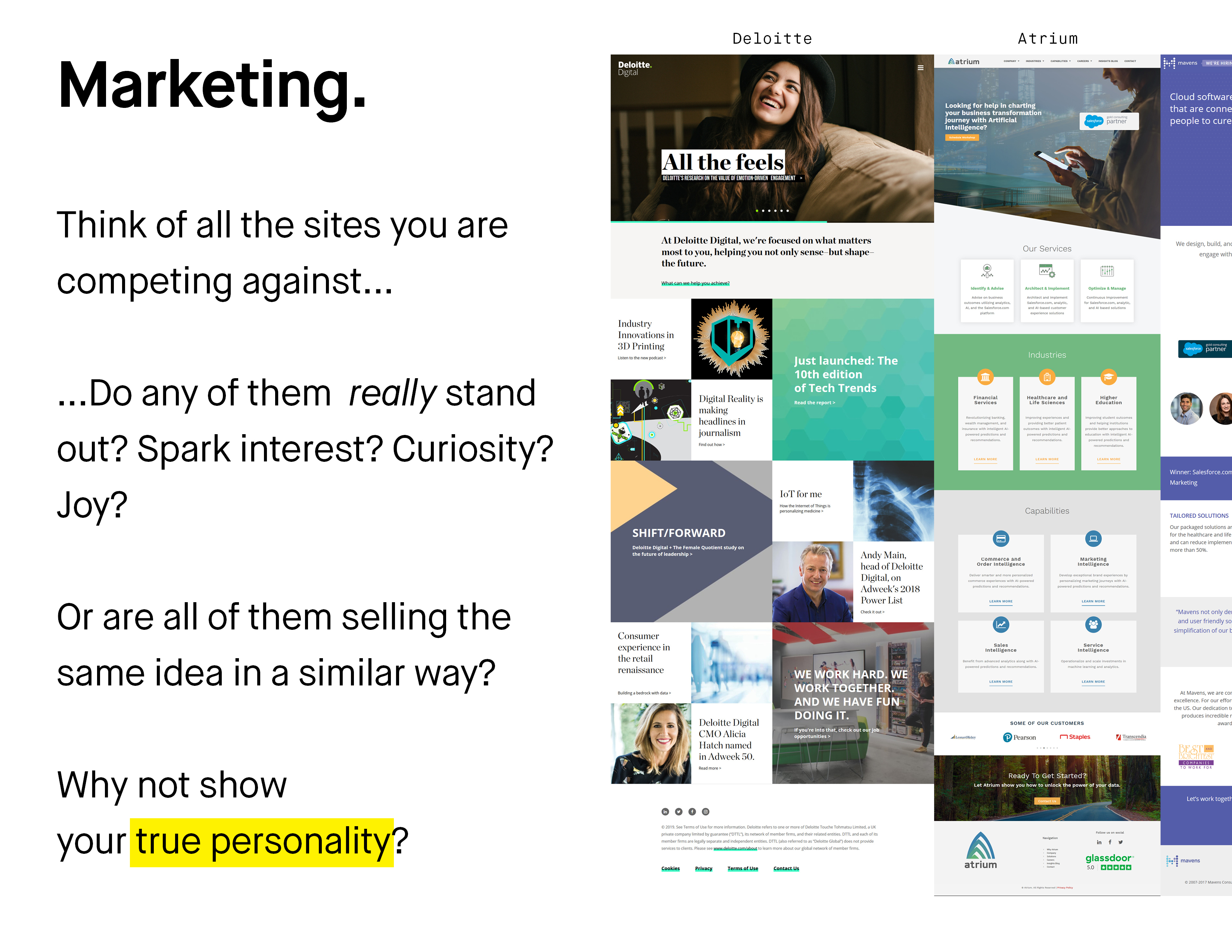
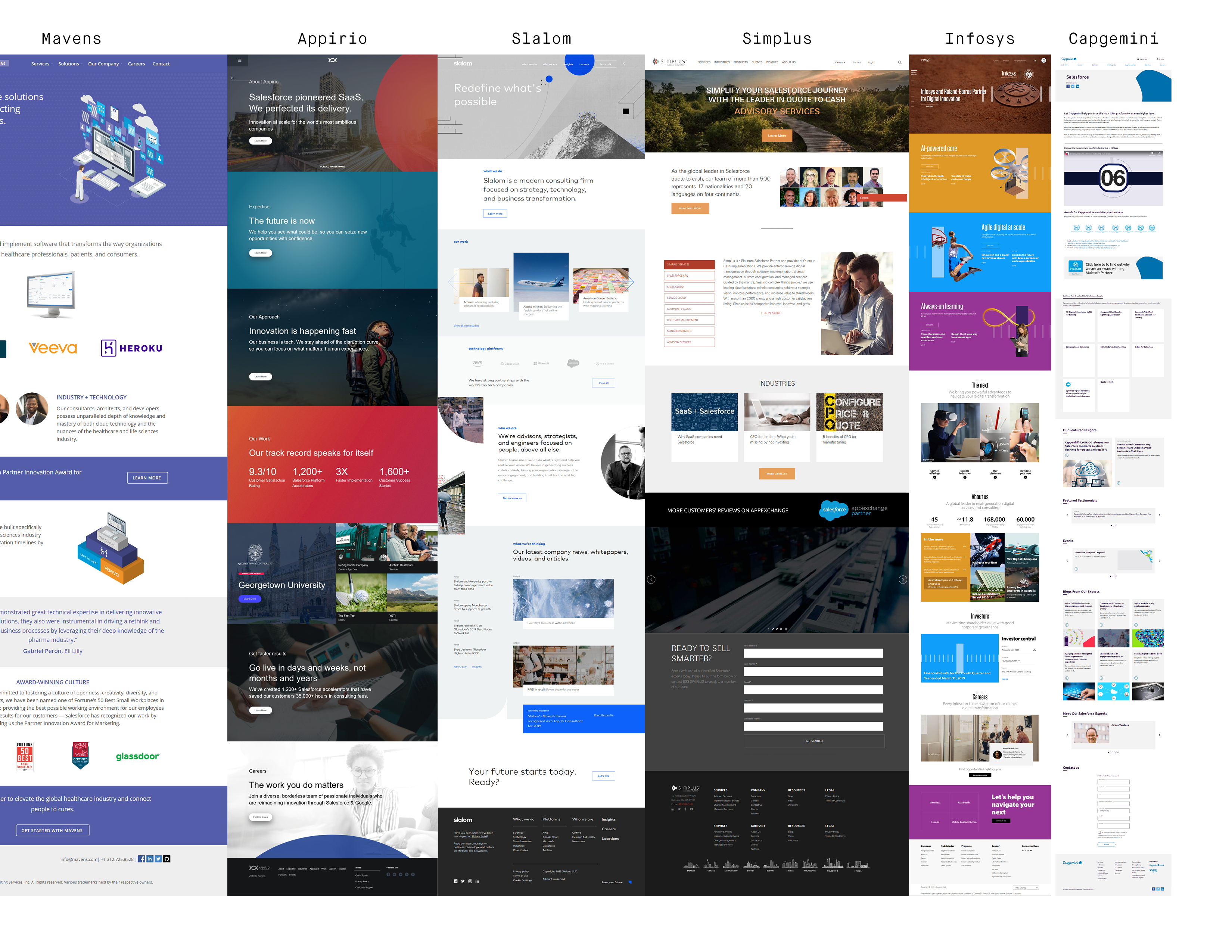
What was meant to be a simple, clean and intuitive service agency experience, has turned into a spiderweb. But not the nice, straight kind - no, the one that spiders make when they're on caffeine…
I brought the usability up to today’s standards. Connected experience to brand, voice, visual, technology, and overall marketing.
Evolution on index page UX.
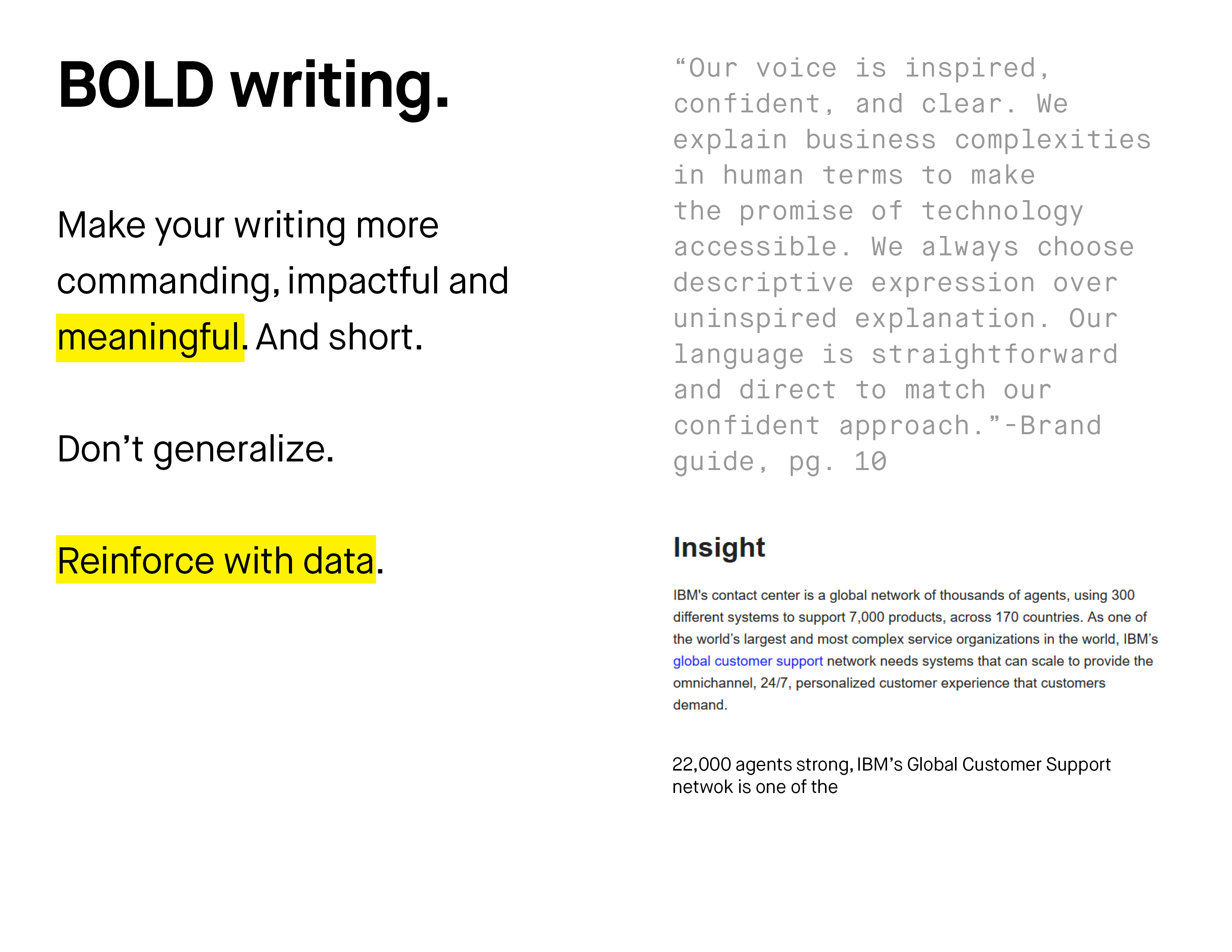
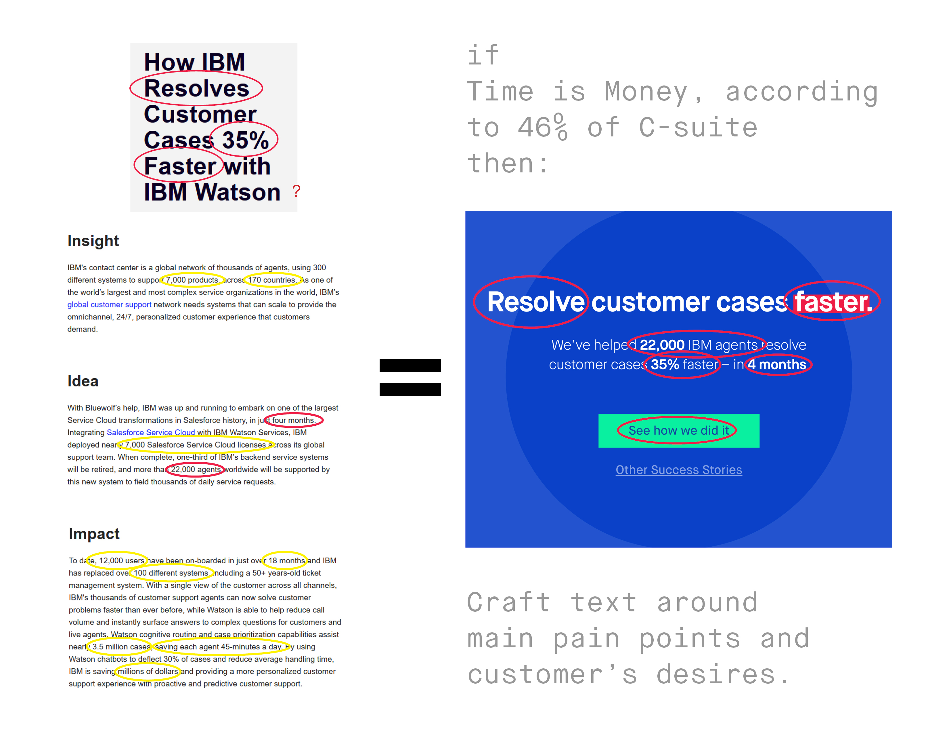
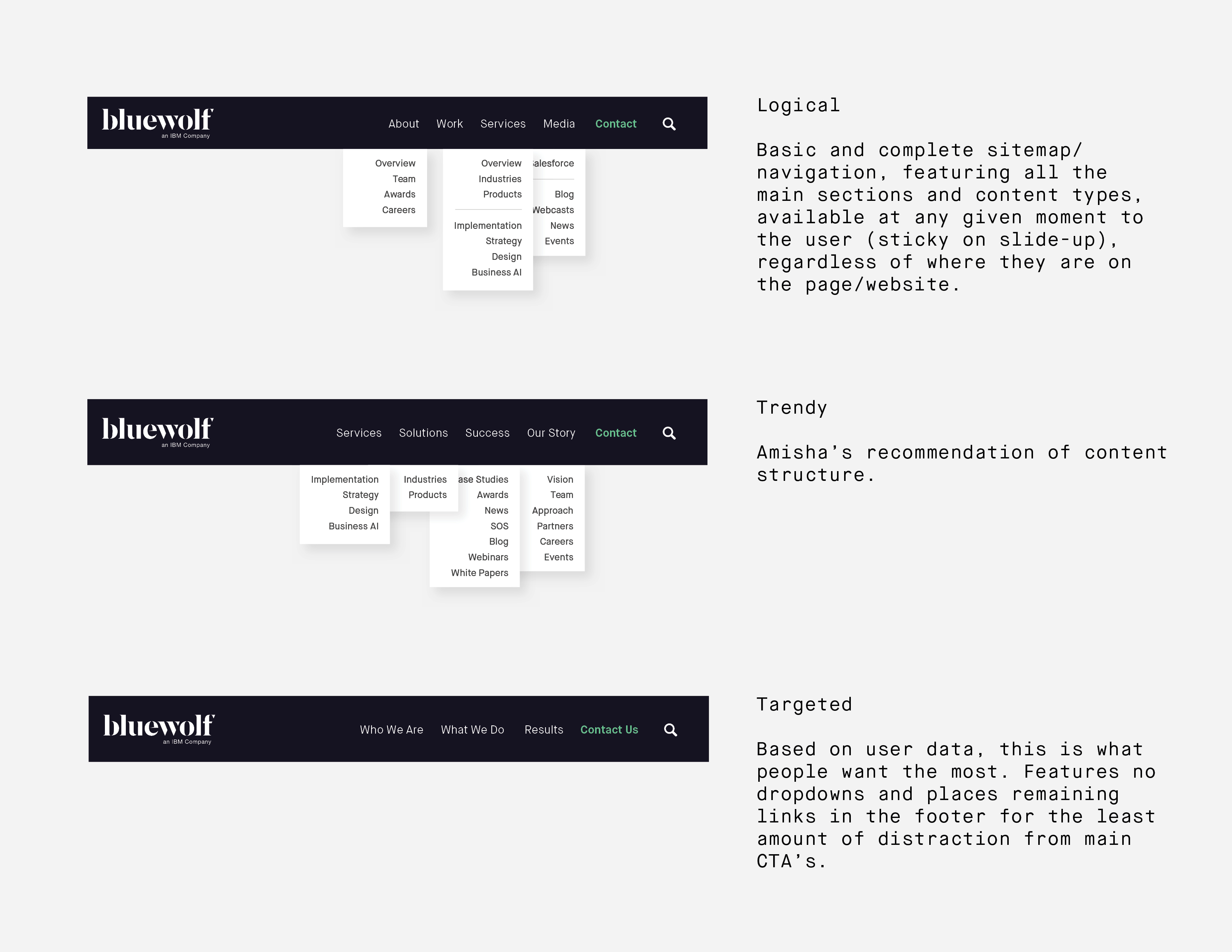
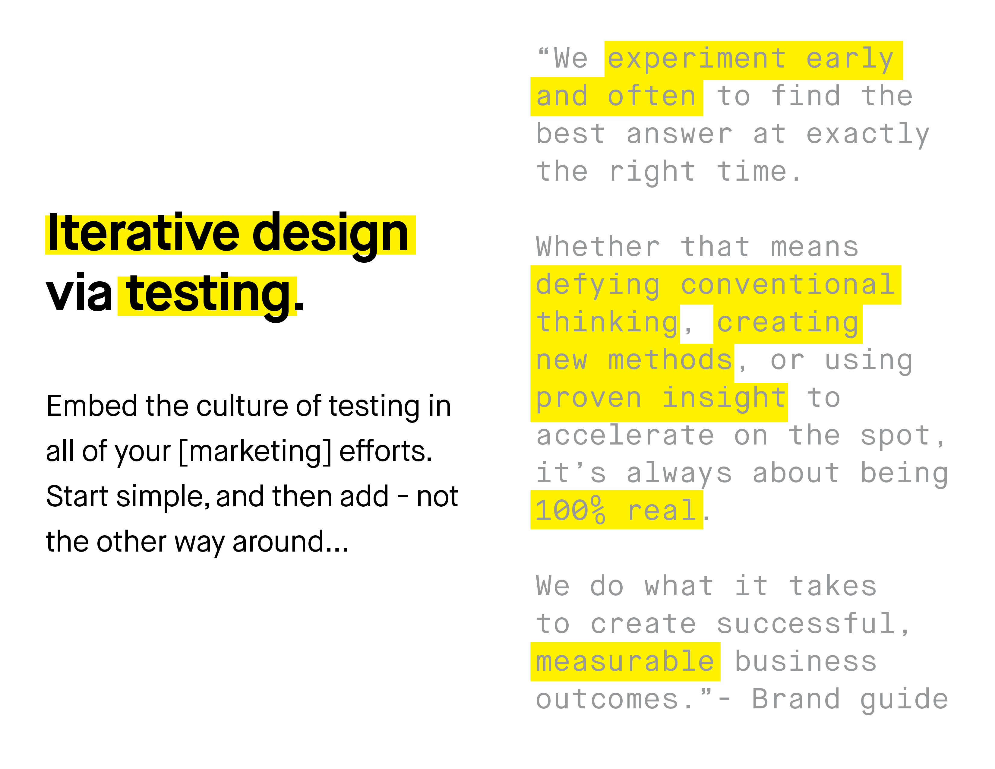
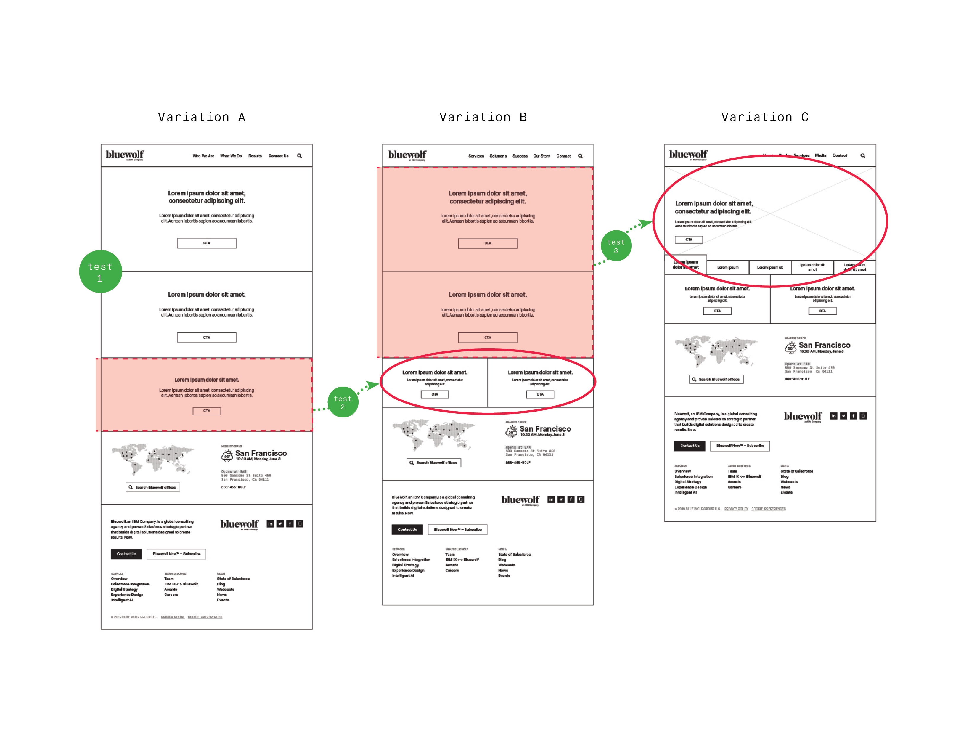
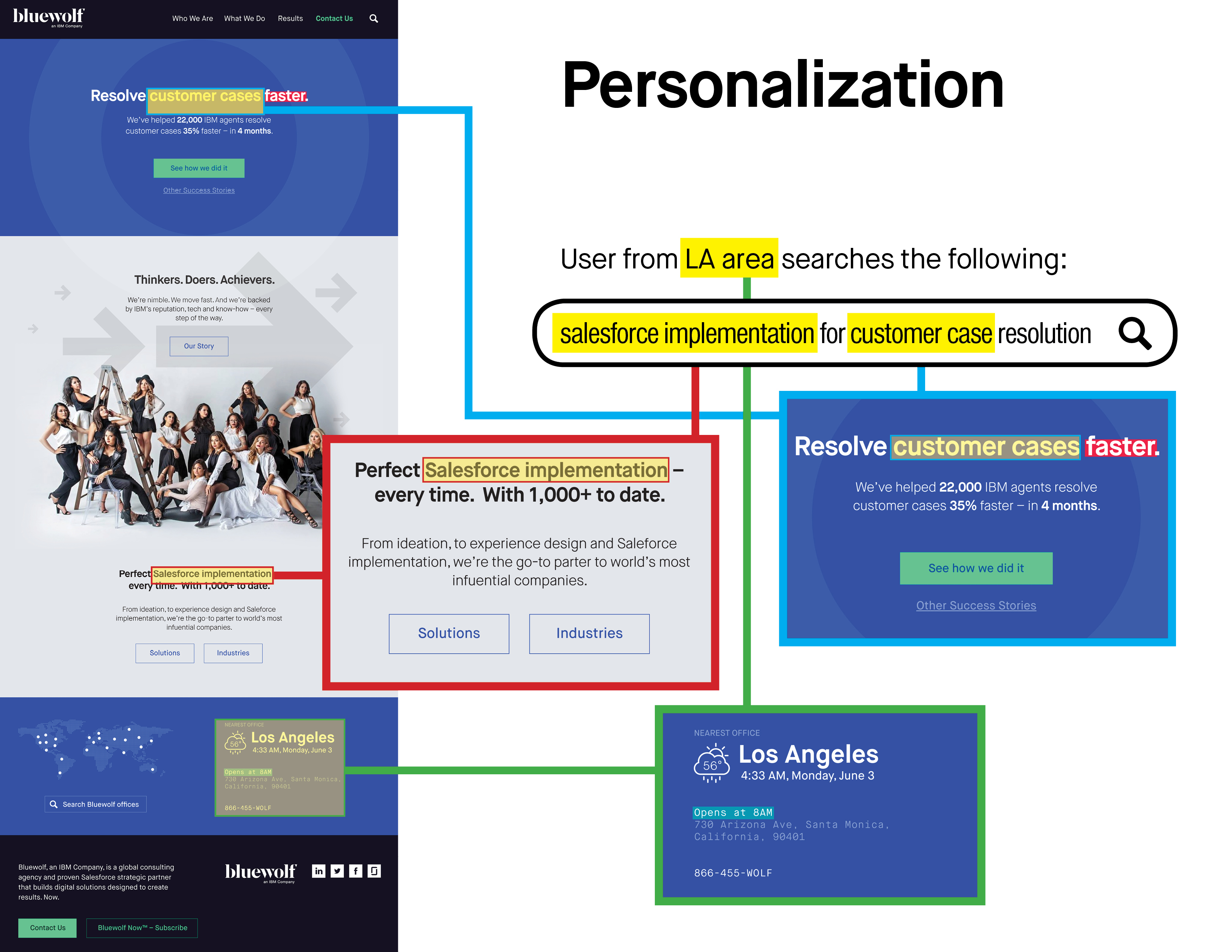
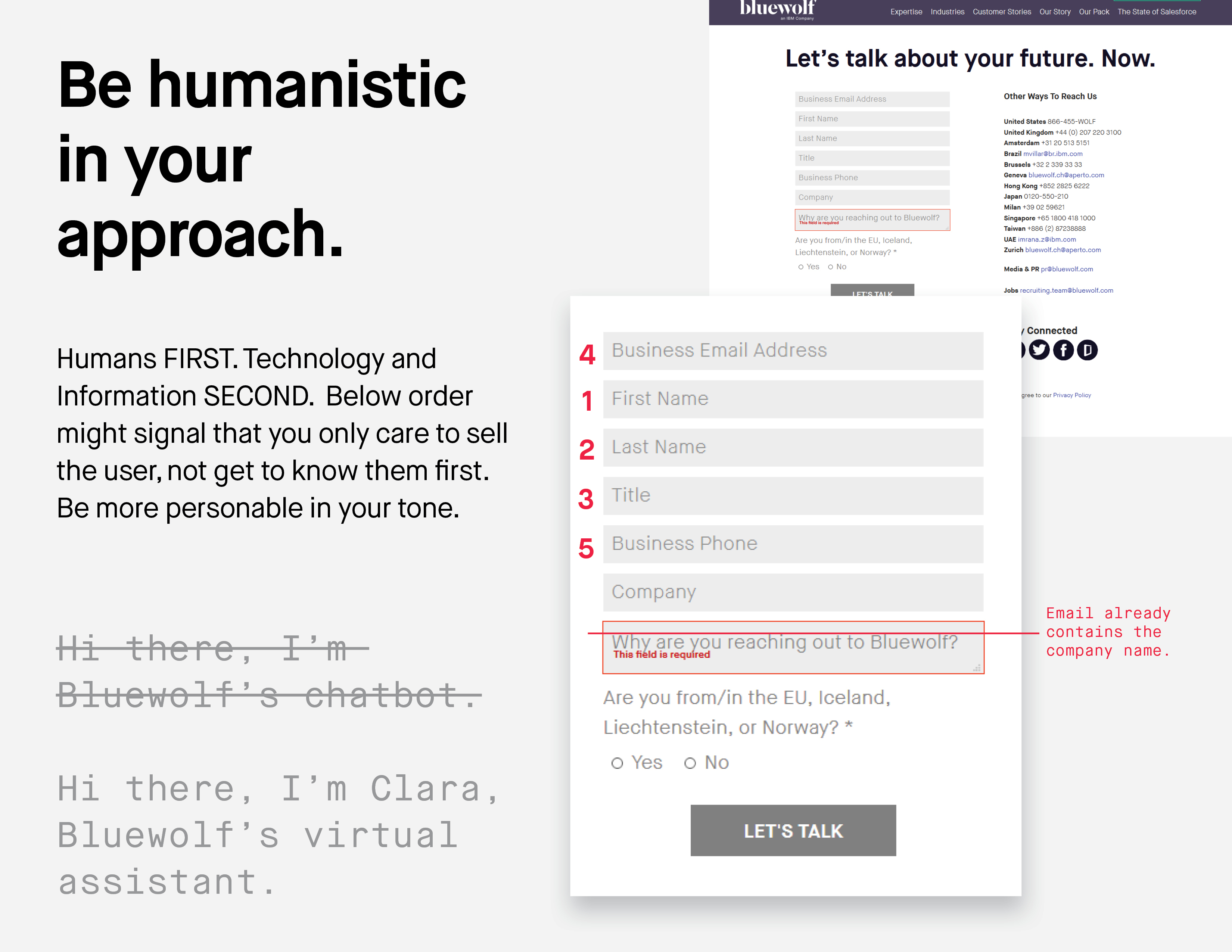

Additionally I've helped to determine benchmarks, and have optimized the conversion rate for main goal(s) via iterative design, data, and testing.
1 I happen to know Drupal well, as this is the system I'd sell my clients back in my agency days.
Enjoyed what you saw? Stay updated by following me.