Leadership Public Schools: Richmond, California school map and directory design
Leadership Public Schools (“LPS”) is a not-for-profit organization founded in 2002 by Mark Kushner to serve a diverse student body throughout the San Francisco Bay. Their schools serve ethnically and economically diverse families and are located in or near low-income urban neighborhoods. Currently the LPS network of outstanding public charter high schools serves over 1,500 students.
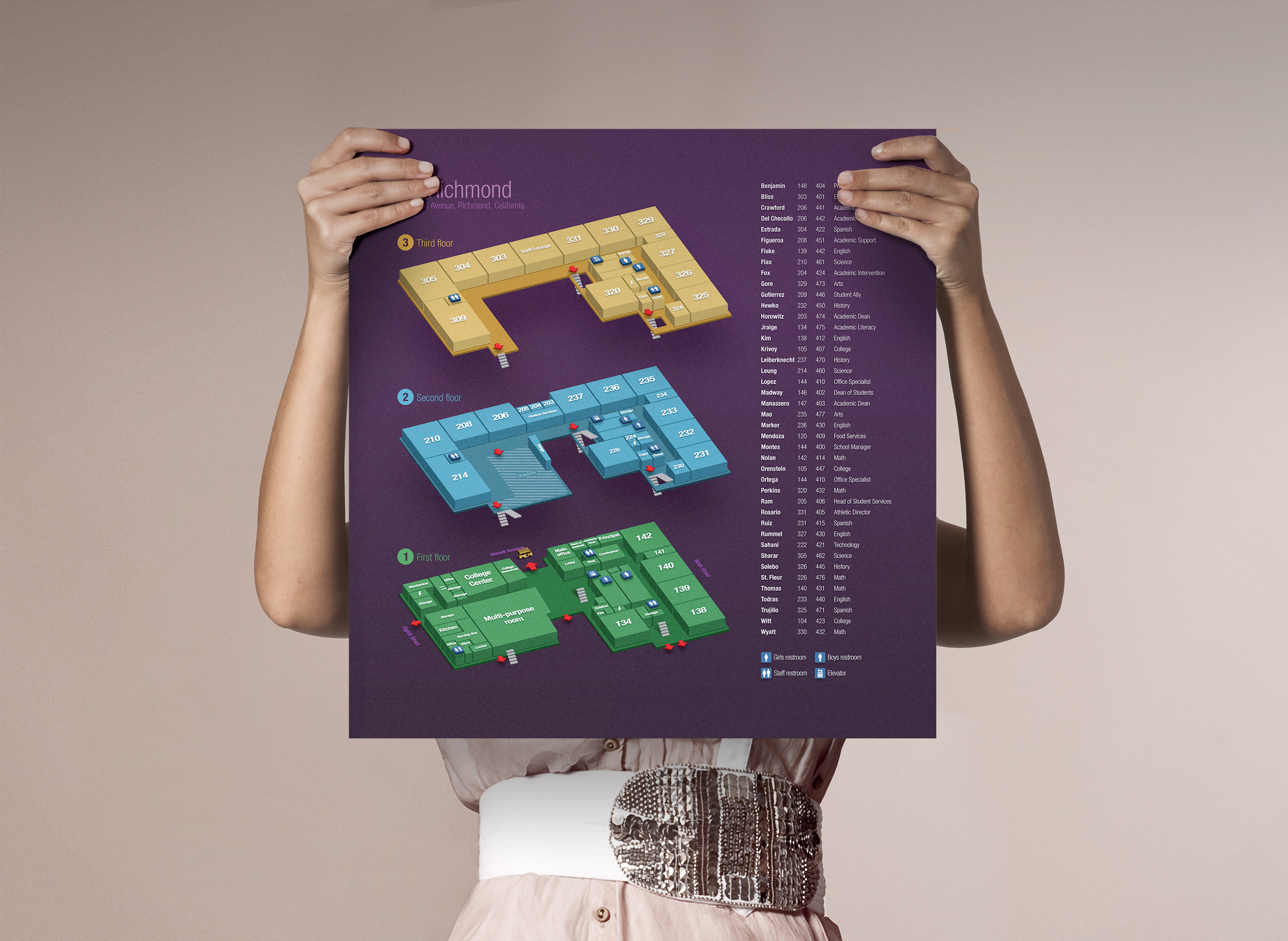
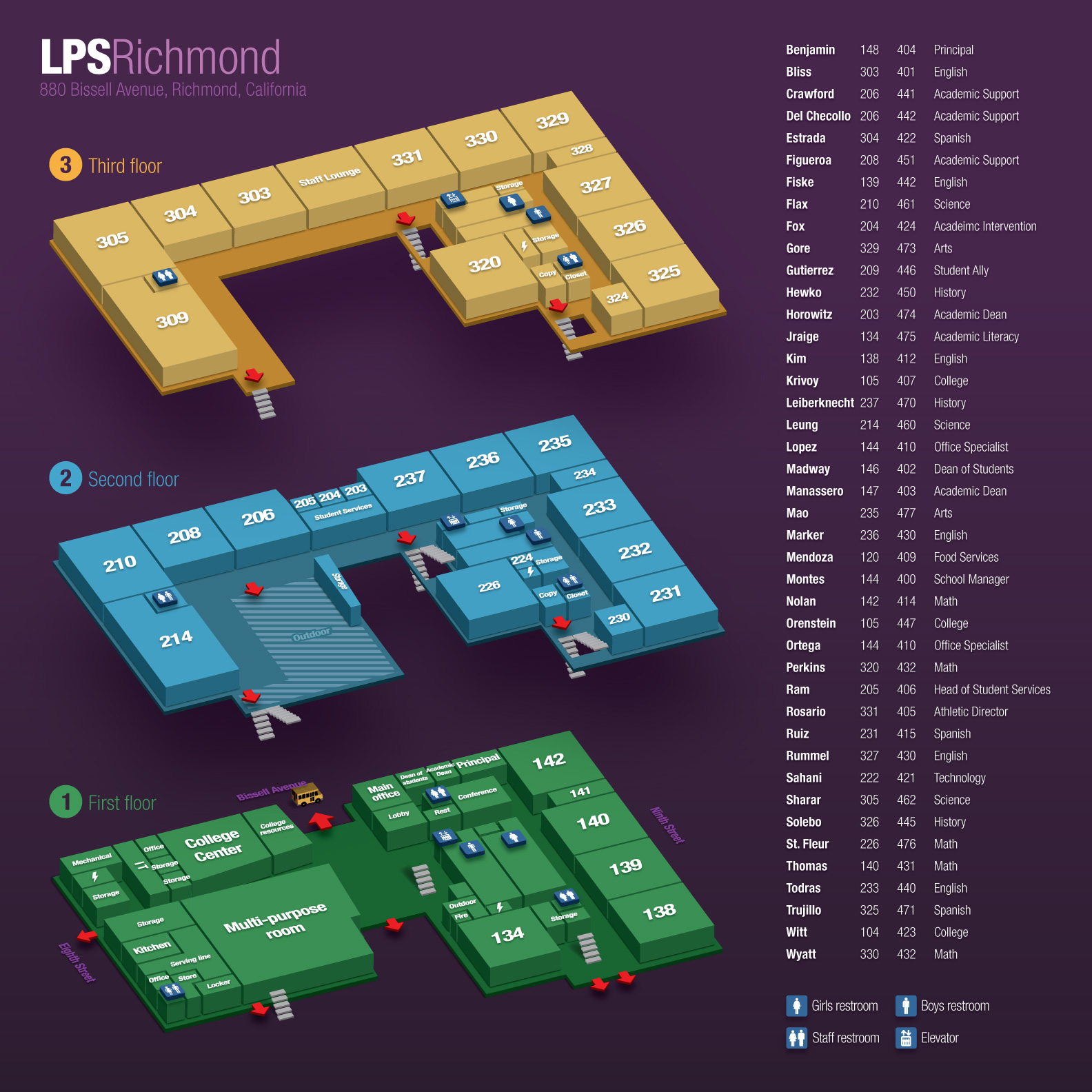
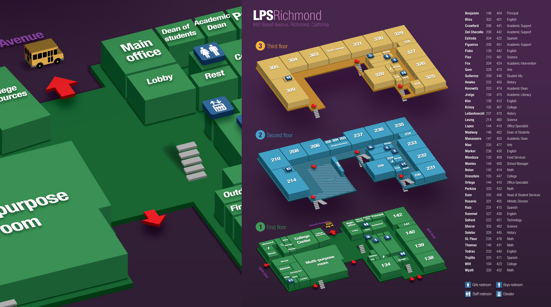
LPS Richmond is a new facility to the family, which opened its doors to the public in late 2015 – just in time for the school season. Since this was a new building, it didn't have any navigational tools to offer to its visitors. Diagrams and blueprints obtained from the architect were overly complex and illegible, and the directory itself was a separate item of its own.
When Jeff Manassero, the Academic Dean for LPS, was looking for ideas for the future 880 Bissell building map/directory combo, he stumbled on a similar project I had written about years ago. Impressed with the outcome, Jeff was looking for tips on how to use Adobe Illustrator (the app which was used to create the directory) to perhaps come to a similar result…
…With September just weeks away, there was simply no time for learning, so I kindly extended an offer to give this project a look.
I talk more about this in the original post (linked above), but in a nutshell, the success in any design lies in not only how easily a user can interact with it, but also, in this case, in how easily it is to up-keep it. With this comes another unique ability: the ability to generate new designs within days – or hours, for the late-night-coffe-drinker in us – not weeks or months.
First iteration of the directory.
I took the extra time to define the pallet and the way information was displayed and placed. Deep, rich purple draws the user in, while making them focus on the important information and details. It perfectly aligns with LPS' established brand, too. Red – which represents evacuation routes (exits) – contrasts nicely with the overall color selection, and is spotted with ease.
All the information in the directory portion is given sufficient padding, which makes it more legible. Teacher's name is bolded, for extra convenience. At over 20", the eye comfortably scans alphabetized list.
Enjoyed what you saw? Stay updated by following me.