Redesigning mobile analytics for Microsoft
I was asked by team Xamarin to re-imagine how users interact with mobile analytics, and to help them with the integration of these ideas into the existing design framework for the Microsoft Visual Studio’s (Mobile Center) 30M+ user base.
I love design. I love design that’s backed by data even more. I find myself constantly interacting with various analytics products, and over some 15+ years of doing so, have come to some firm beliefs and expectations, which many of the analytics products lack. This was a fantastic opportunity for me to put some of my thinking to use in a real life situation, so to speak.
Xamarin's and my story date all the way back to 2012, when I was considering coming on board as a first full-time designer to essentially lay out company's future brand. However stars didn't align and I had to pass up the opportunity.
What I did end up keeping were the connections. (Never 'burn bridges' in general, especially in the Bay.)
The moment I stepped into the tight, three story Pacific Ave office, I instantly 'clicked' with Xamarin's crew. At the time, two people could probably count all of the employees on their four hands. Being surrounded by an agency environment for the majority of my career, I felt right at home.
…By the end of our first meeting, Nat, one of the founding partners and company's CEO at the time (last I heard he was CEO of GitHub; VP, Developer Services, Microsoft) and I had already begun discussing our first flight together, since it ended up being that we're both aviation fanatics.
But the particular connection I'm talking about was established with a different person – one of the developers, who later turned out to be an eccentric, cold-water-plunging (amongst other things), generalist-designer extraordinaire – and the person who invited me there in the first place.
David Siegel at the time was leading all of the design efforts and needed to re-focus his attention on more pressing tasks of the moment. Which is how the role was created. The rest, as they say is history.
Fast forward four years…
Towards the end of 2016 – and, I should note, thanks to poor design, sub-par development, and run-of-the-mill marketing efforts on their Windows Phone platform – Microsoft was re-entering the mobile market in an unusual way via several key acquisitions. Perhaps the most notable company-wide mental shift came along with the acquisition of a fairly small startup from San Francisco, by the name Xamarin.
Notable highlights:
• Challenged common design thinking when it comes to analytics and data.
• Re-imagined approach to understanding/analyzing data for a more engaging experience.
• Simplified workflows and interactions.
• Worked around, and integrated my designs into an existing front-end system.
• Collaborated with a small team of some of the most prominent designers who were ‘redesigning/redefining Microsoft’ as a whole.
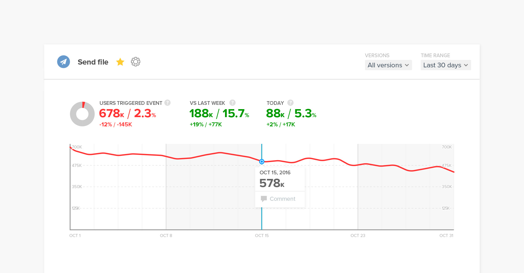
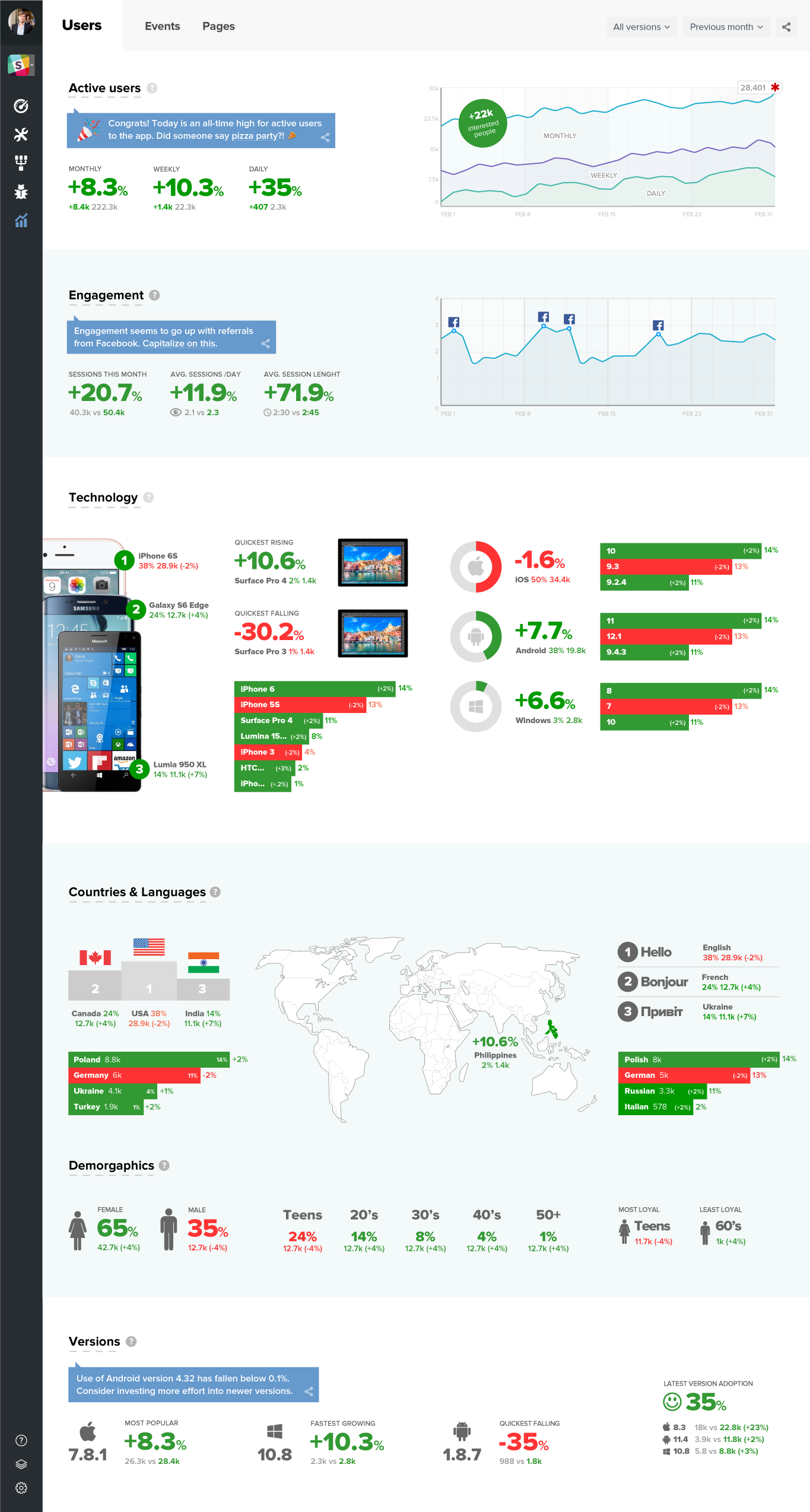
The idea was very simple: make experience more valuable, by making it more useful.
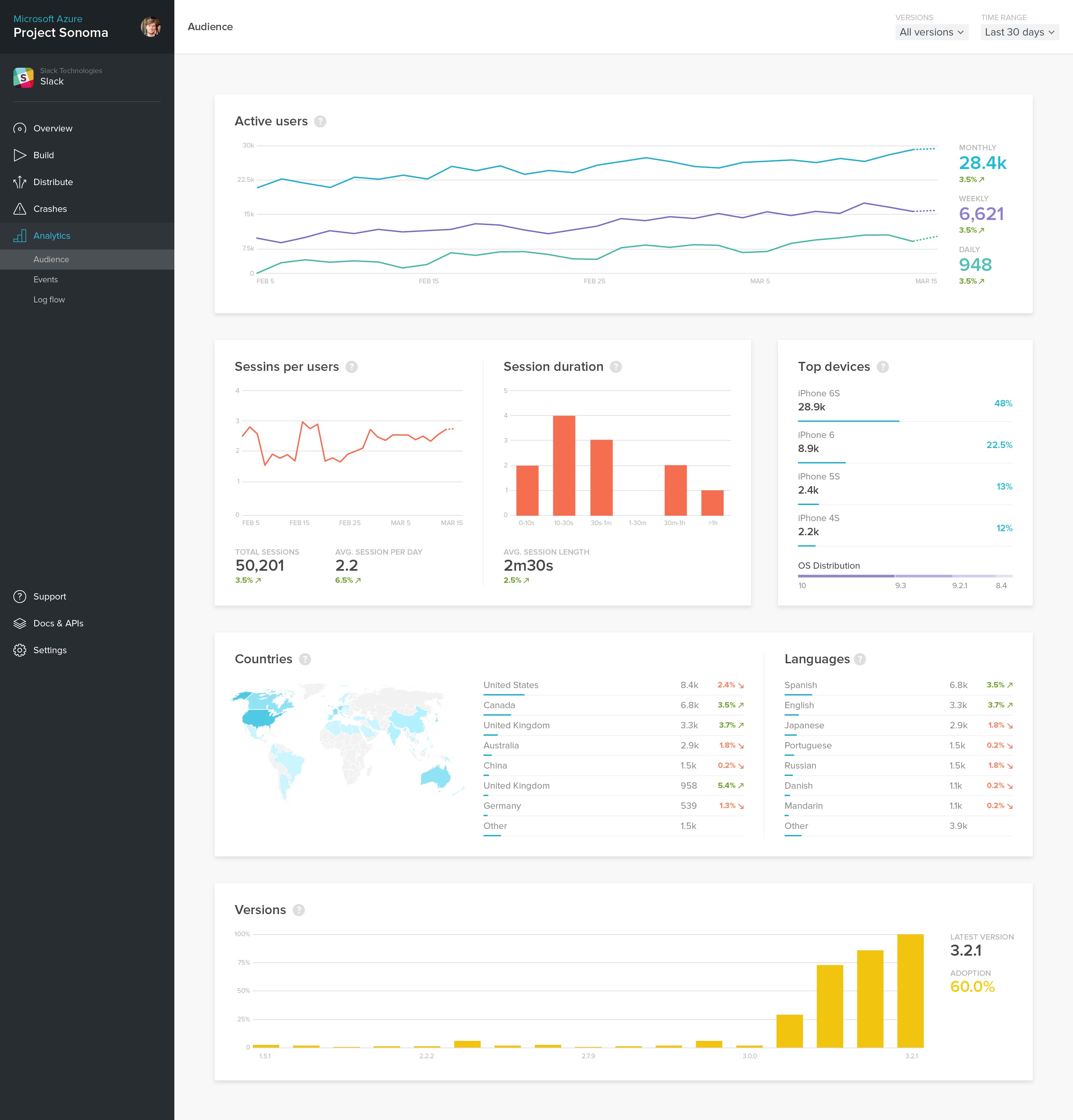
For the most part, analytics design and core thinking revolves around showing data that is unactionable and meaningless since it is taken out of context of the timeline.
When a user is given a single performance number, there's simply no way for them to position themselves as there is no benchmark to do so against.
With this idea in mind I've made it so that important metrics are always accompanied by a positive (green), or a negative (red) symbols and a set of numbers that aim to tell a more complete story without them having to dig for more clues.
Stock market does this in a similar way, though majority of trading platforms come short in data visualization and general usability departments.
Such information presentation was only the beginning…
Positioning the user against what has already happened is great, it is even better if each story also has a 'future'; what if the same could be done to predict and prepare users in smart and meaningful ways? Though such design is a few years away, it is always great to have something to move towards. Be sure to check some of the concept work at the bottom of this article which touches on this concept.
It goes without saying that the point was to make things dead simple and the opposite of what Google Analytics stood for in terms of its design ambiguity in early 2016.
If you are a regular GA user, starting 2018 you might have noticed an introduction of some radical changes in the overall product design thinking/structure that mimic the concept of telling a more complete story (on top of simplification).
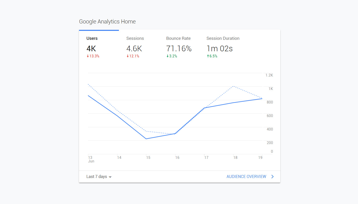
Although Google's improvements are great, they, again, fail to tell a more complete story as you are only given a big number and a percent change, leaving the user with calculations to do in their head... "What was the 4k before the 13.3% drop? Just how many users did I lose?
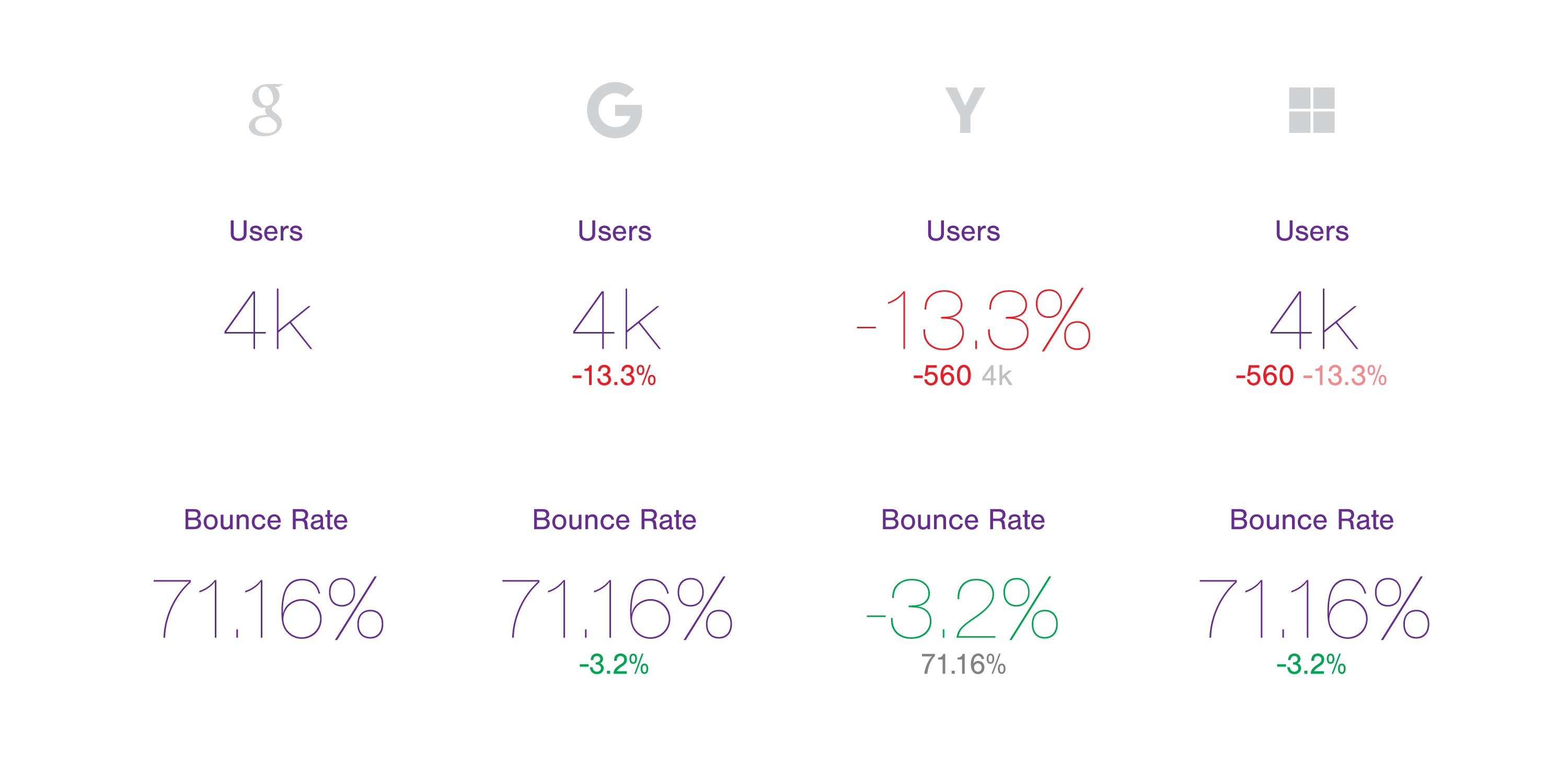
Above illustrates the evolution of analytics thinking: my concept (2016), post-2016 Microsoft thinking with my concept implemented, though slightly altered, and the pre and post 2018 Google Analytics thinking.
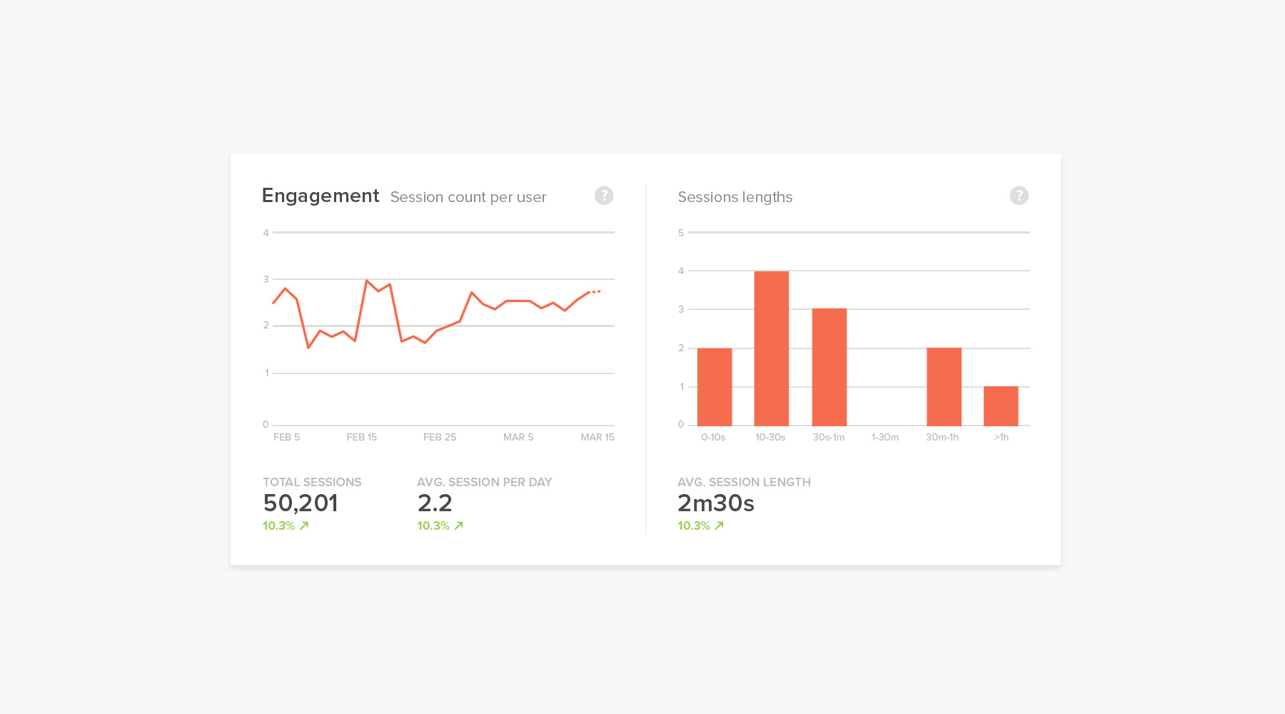
It is my belief that at the end of the day, the most telling metric is the percent growth. As such, my design is based around that idea. Total users is a nice-to-have, which is why it has been included as a "final say", but visually downplayed, to keep the user on what matters most – the change itself. If you start getting into details of quantities, you are introducing more complexity…
Seeing the actual numbers should feel like an 'icing on the cake' of the overall experience of reading the information – you are providing the user with a more complete and concise overview without creating the need to further explore.
The team didn't feel they were ready for such a drastic change, so they have settled on a compromise which is what you see in the fourth column…
One funny note to make – Google's new (2018) "Insights" concept is essentially a clone of what I have proposed in 2016 to the Microsoft team in my concept (bottom of post). Unfortunately the team didn't feel so strongly about the idea as I did….
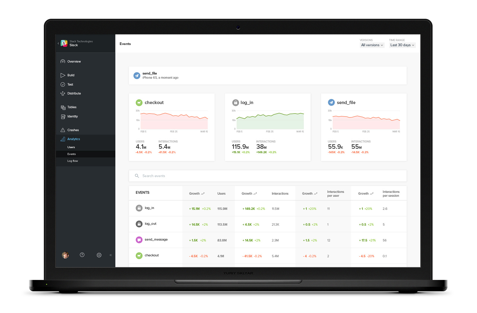
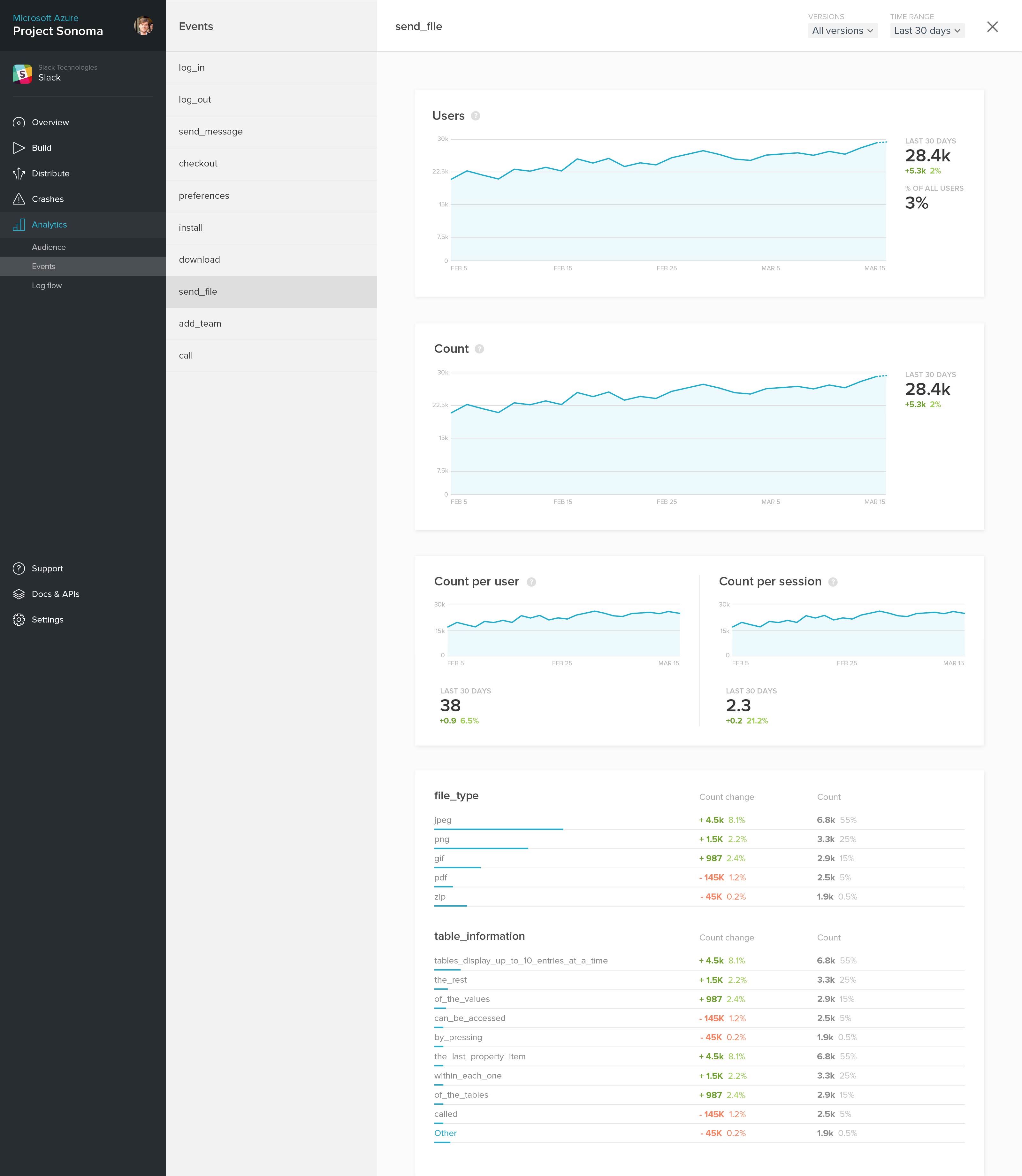
Analytics Dashboard design

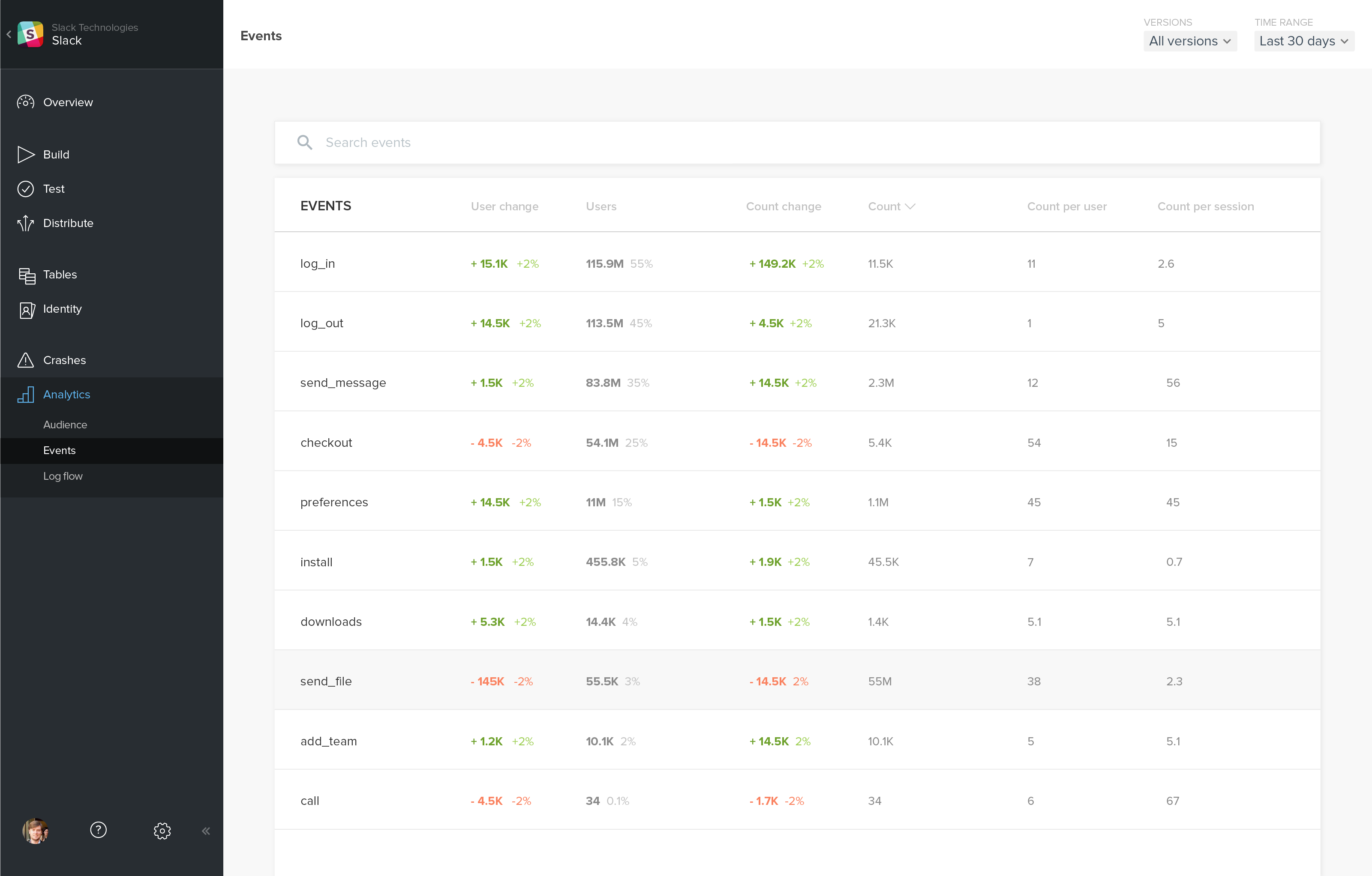
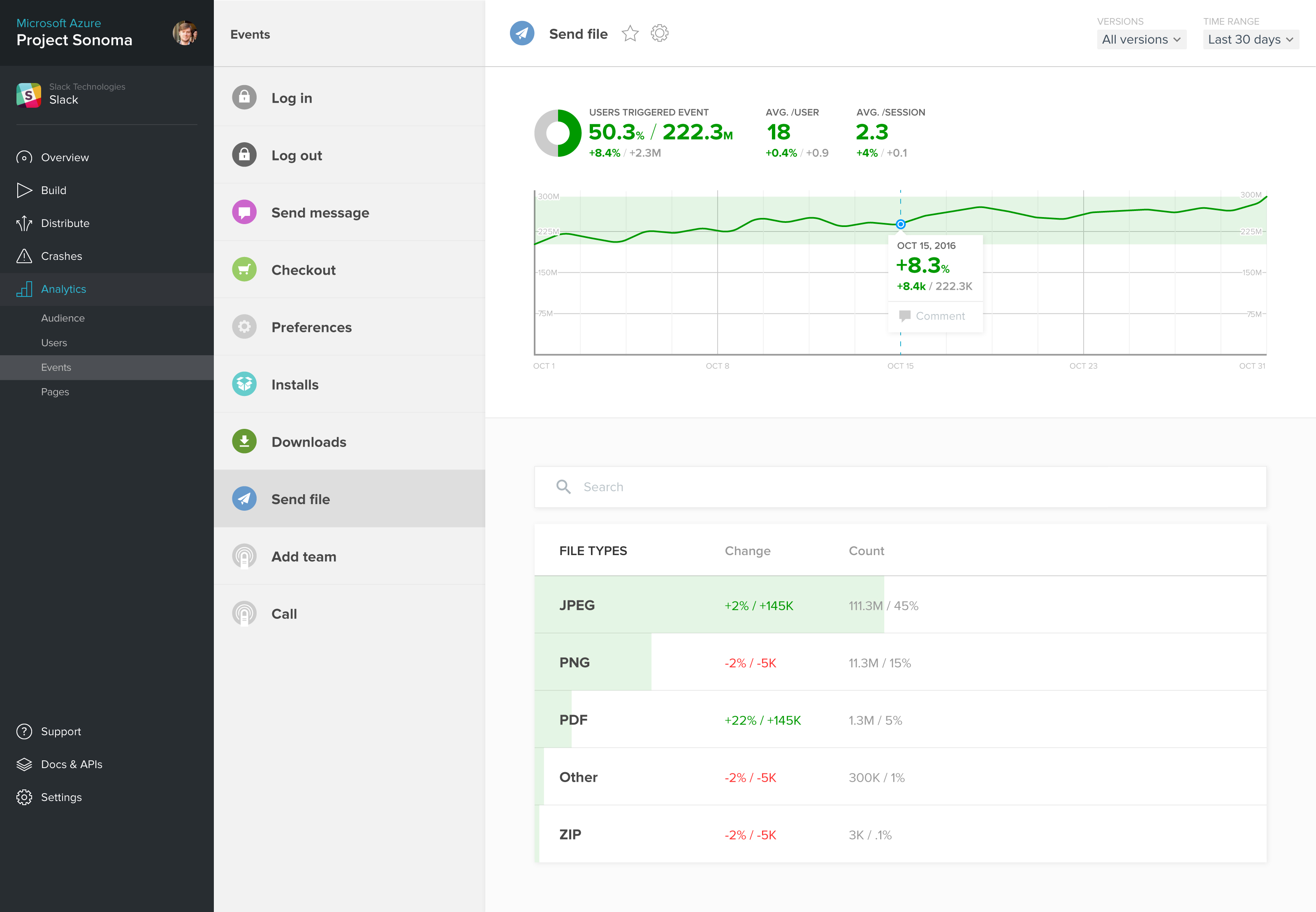
Events view drilldown
I always thought the contrast of some framework elements needed tweaking... I'm all for text – especially such elements as headings – to be as legible as possible.
One constraint I had to work around was the overarching design/template structure.
I wanted the experience to feel more like the investment market, where you find yourself constantly interacting with timeline range selection.
I find the same happens quite frequently in analysis of app data, so it was important to create a smoother flow of this particularly heavily used pattern – and move away from the annoyances of dropdowns.
Analytics is boring. I won't be the first person to say this. But it doesn't have to be.
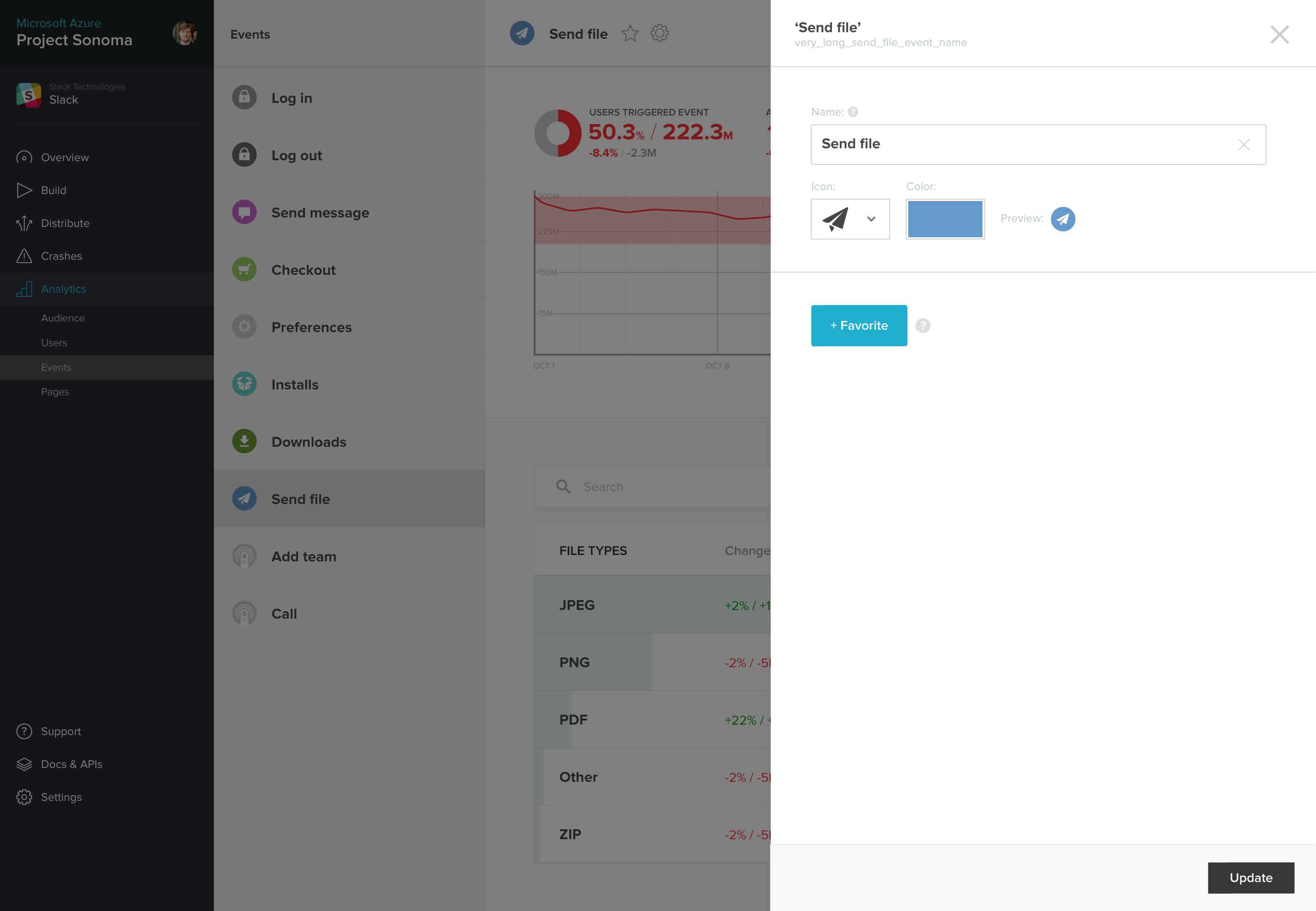
My intent was to introduce the team to the idea of basic customization/personalization – something that would make the process more unique, more personal, and perhaps more importantly, more useful.
Customization of Events was how I ended up introducing the concept.
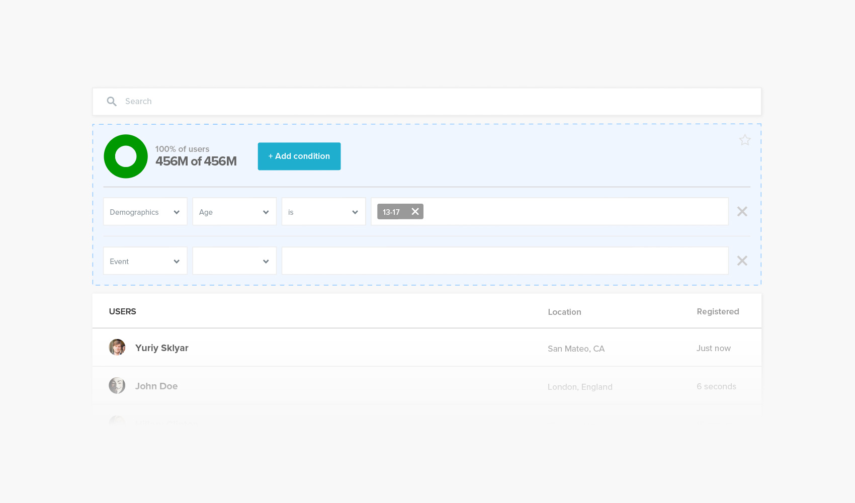
Search & Filtering
Concept
I always think that the best work is the very first design iteration you create. Sure there is always room to grow, but the most inspired work will be your first take.
I still stand true to this statement to this day.
More human, more infographic-like, and less overly-modern/'clean'/soul-less.
Enjoyed what you saw? Stay updated by following me.