Redesigning the Stock Market
...One feature at a time, I'm looking at the investment industry as a whole using my 'UX (user experience) lens', and adjusting things as I go. Check back here for new thoughts.

Experience starts from the smallest details. The simplest of actions/features contribute to the overall picture. If users are stuck in a badly designed pattern, they are wasting time and are not getting what they want which results in a subpar user experience.
One of the most common features in the investment world are notifications and alerts. Here's a quick look at how the biggest investment platform handles the task:
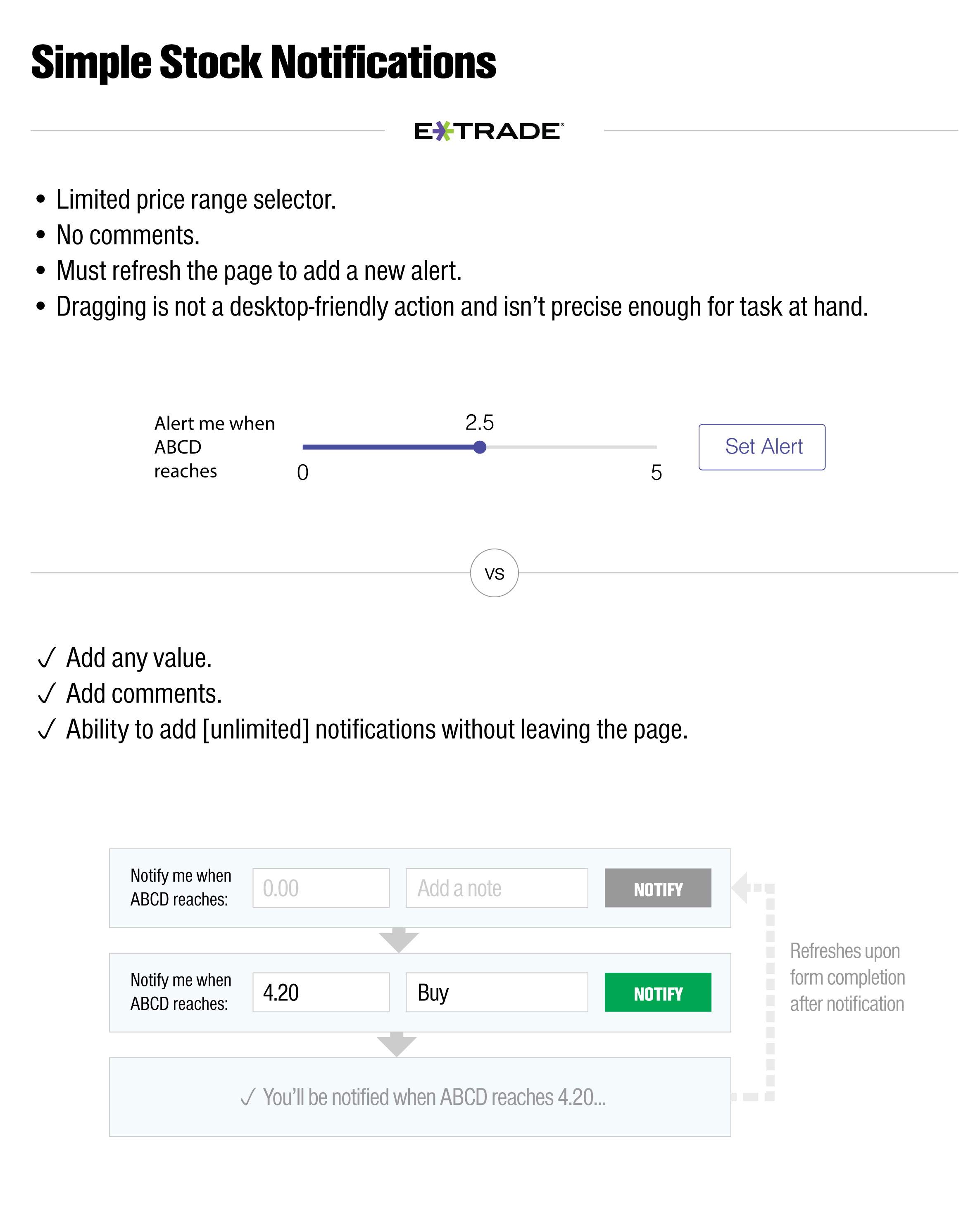
It is best not to over complicate. In this industry people are already used to typing and clicking, so instead of over-simplifying the experience from a graphical standpoint by using dragging, I felt that the proposed design solution would be more useful and appreciated by users in the longer term use. It also requires less resources to implement and maintain as it doesn't use any special scripting.
Enjoyed what you saw? Stay updated by following me.