103 Green Avenue house remodel – a simple, thoughtful approach to remodeling a home.
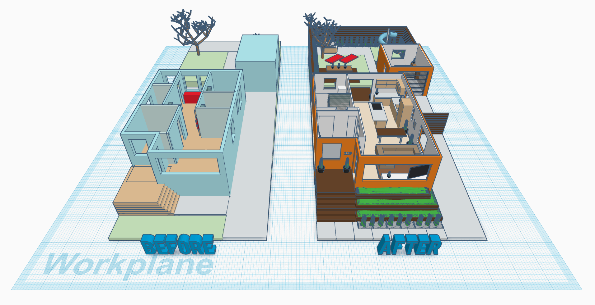
I'm a firm believer that remodeling a home while increasing its curb appeal should not cost you hundreds of thousands of dollars, and 103 Green Avenue is a true testament to that. Designed to fit a modest budget of $50,000 (keep in mind that this is Bay area we're talking about, where dilapidated homes sell for $200,000 over asking price), the new layout was meant to comfortably house a family of four.
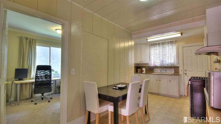
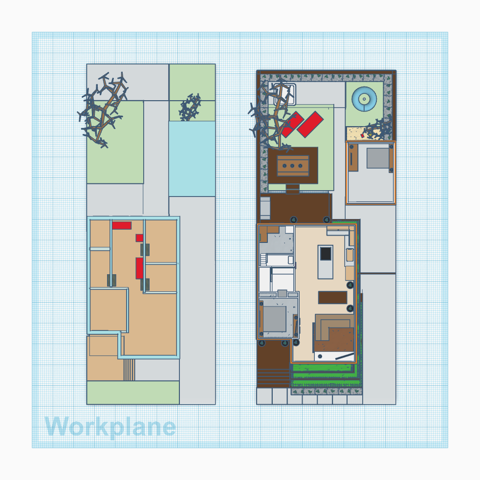
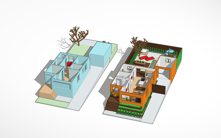
To the left you can see the plan which the house came with. The biggest drawback was the poorly planned kitchen and dining areas. Kitchen had no usable counter space, and was broken up by several doors. Dining table was pressed against the wall, allowing only four people to have a meal at the same time.
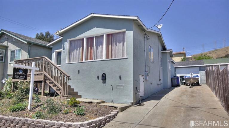
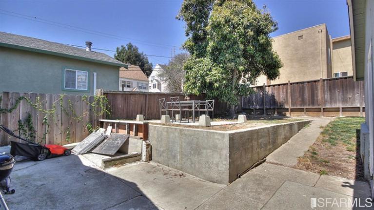
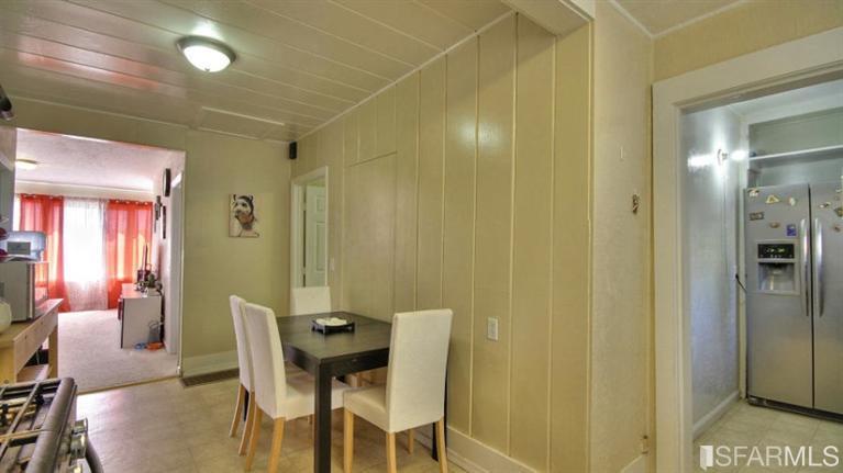
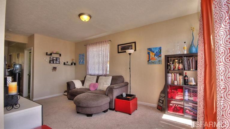
“Before” photos which were used to attract potential buyers.
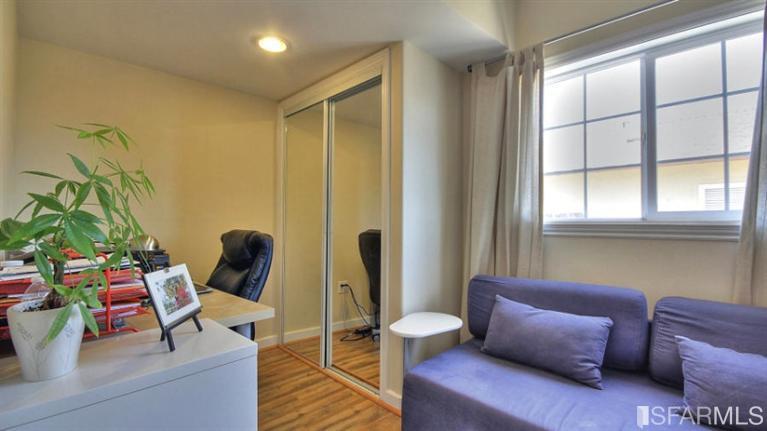
The previous owner decided to add a small office which could only fit a small desk and a loveseat with virtually no space to move about right next to the bathroom. This addition ate into the kitchen space, making the house feel much smaller than it should, and caused the kitchen to be quite dark as there was now only one [curtained] window to provide natural light.
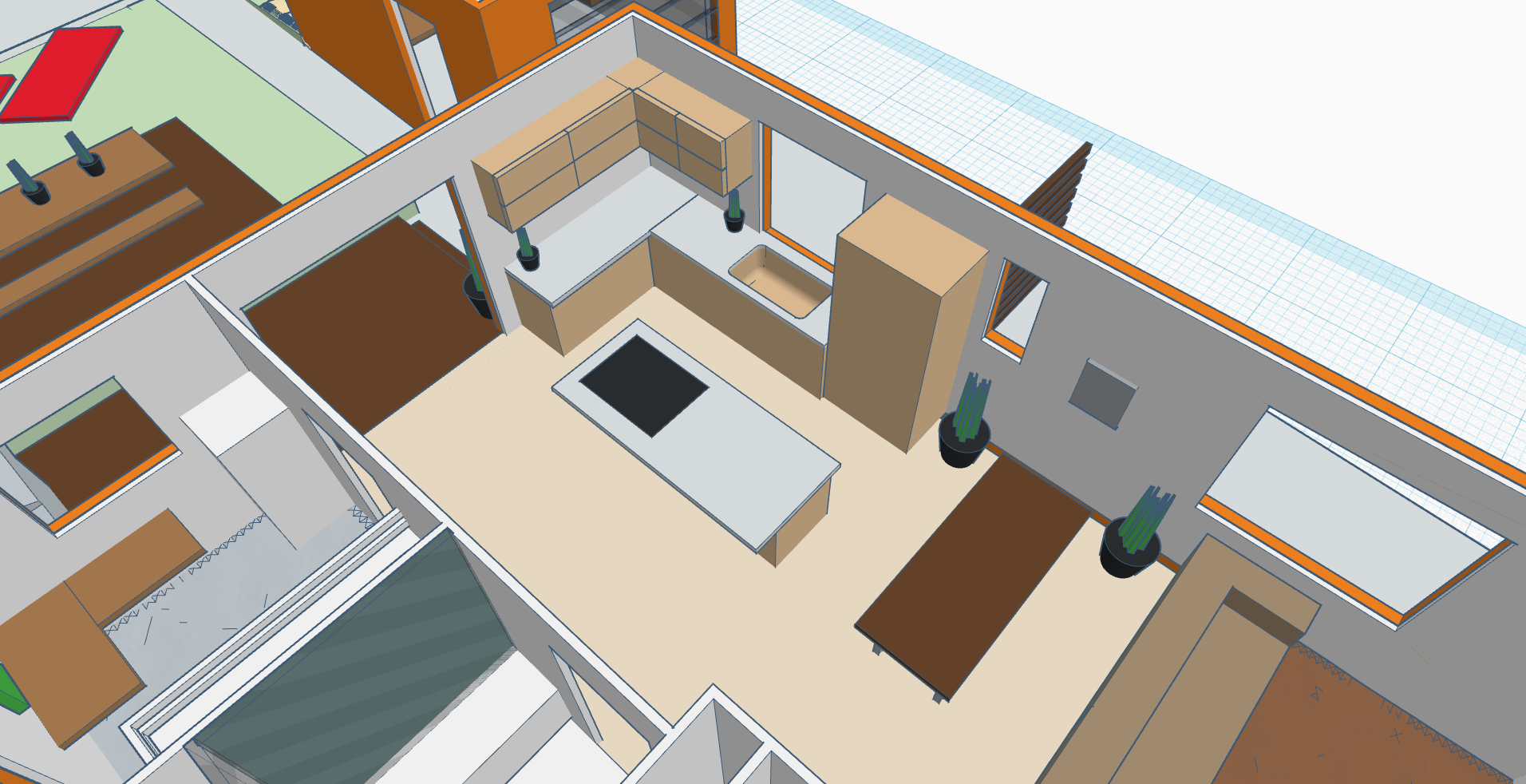
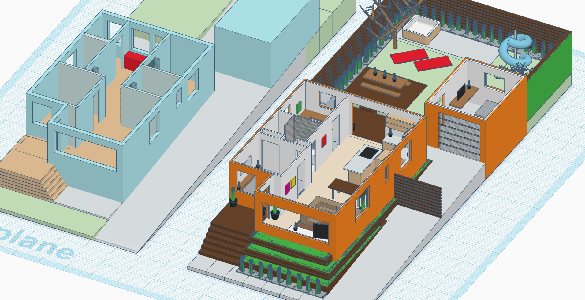
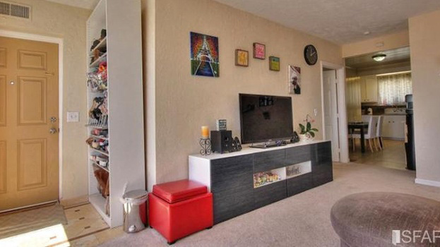
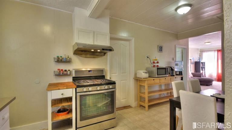
The most grand decision of this entire remodel was then made to delete the tiny office room and move the bathroom over to the opposite side of the house, separating the master bedroom and kid's rooms. This action alone made the much needed difference to truly open up the residence. The new open concept plan now allowed for an addition of full-size kitchen which featured an island with a stove/overhang range. The change also allowed for more natural light to flow through the building as all of the windows were now exposed.
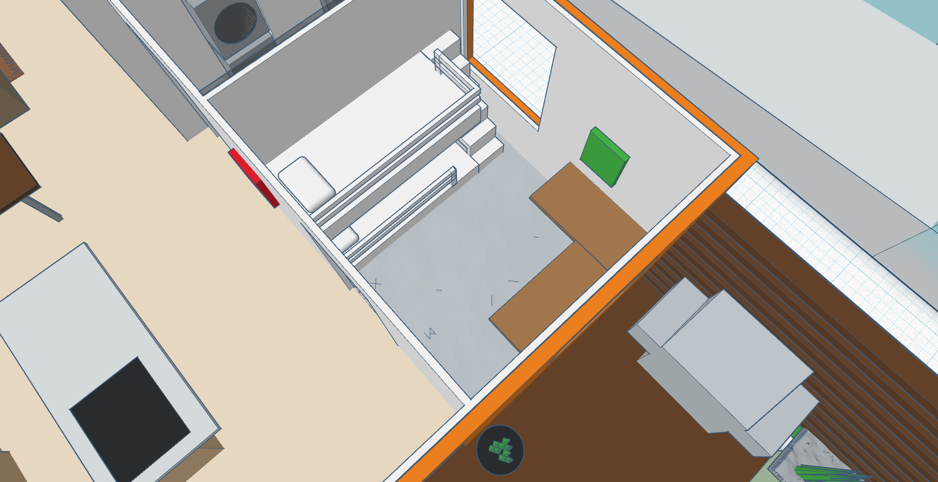
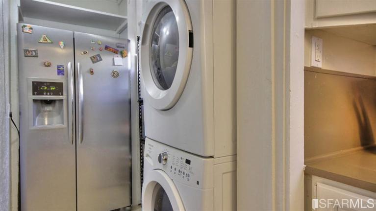
The deletion of an awkward hallway which not only acted as a pantry, but also housed a full size fridge and a washer/dryer combo (something that should never be placed in the kitchen area to begin with) allowed for the kid's room to gain a sizable amount of square footage.
Removal of the wall which separated the pantry from the second bedroom revealed another window, allowing for ample amount of natural light to enter the room, which is crucial in proper development of youngsters. Kids now had a better view, too. Instead of looking out at the wall of the neighboring house, they now could enjoy a view of the backyard.
A custom designed bunk bed with storage and an "L"-shaped desk were placed to allow for two children to comfortably spend their time in the room.
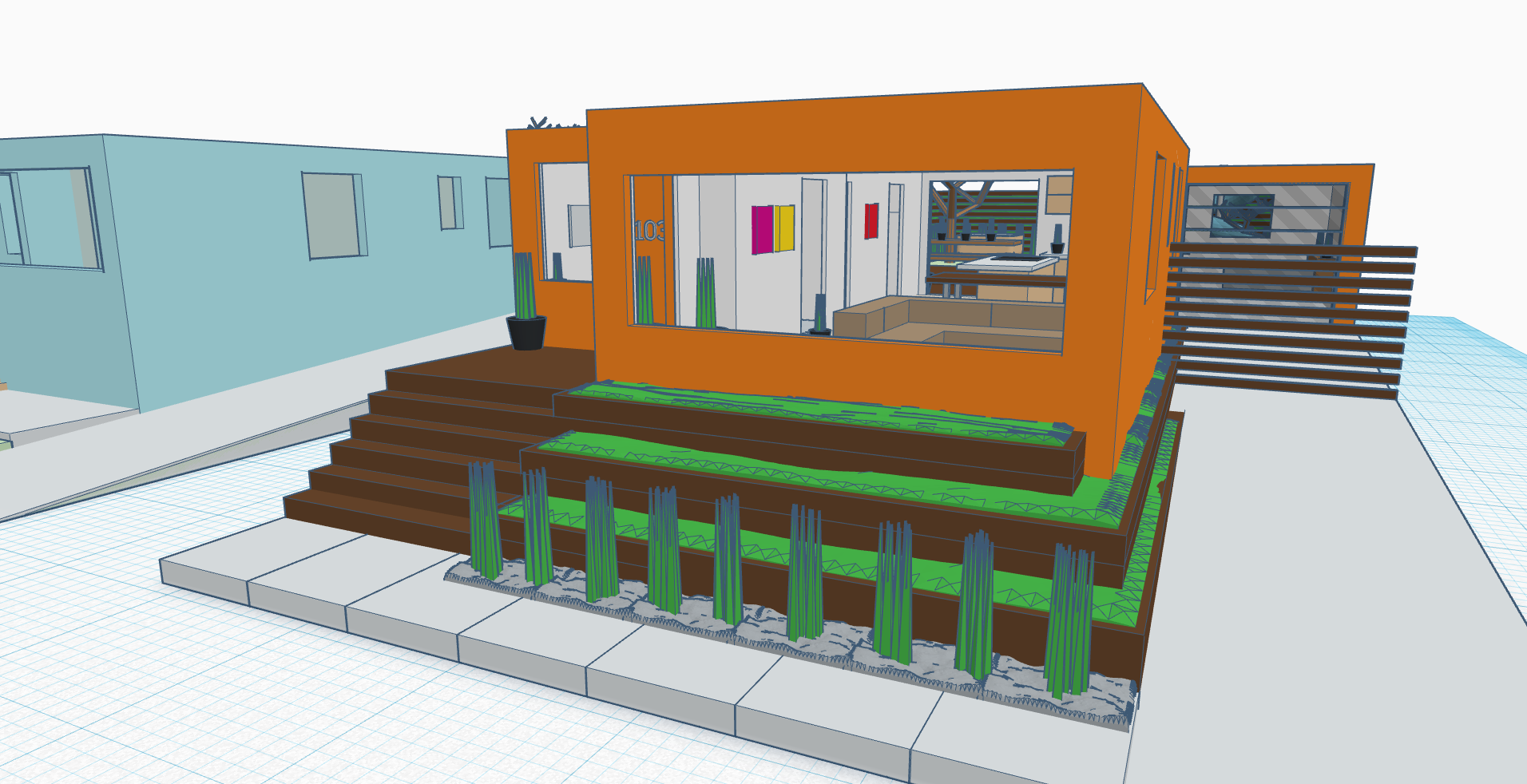
Some minor visual changes which proved to have major impact on the curb appeal of the home were done to the exterior of the house as well. The unusually tall, bland wall leading up to the main living room window created an abrupt drop to the street level. Being on a slope, this made the house look out of proportion when compared to the surrounding buildings.
This was amended by building a three-tiered succulent garden which gradually uplifted the house and further emphasized the elevation of land on which the house sat on.
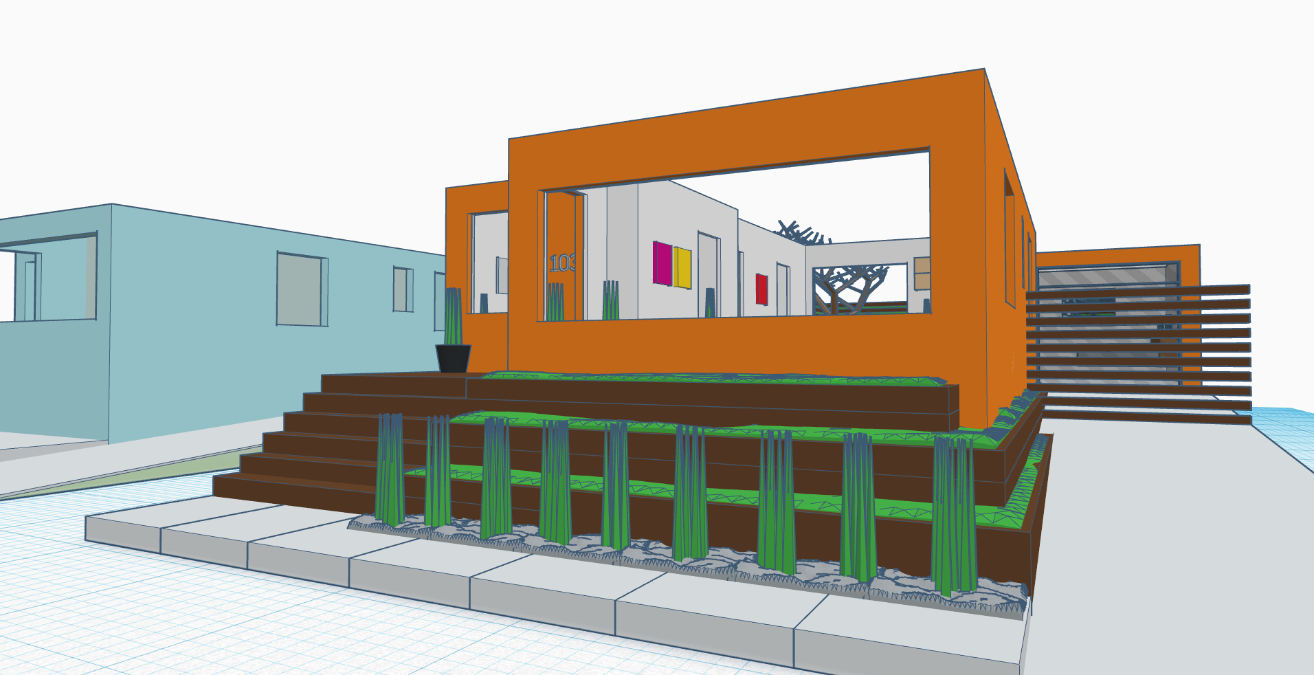
The [not-so-usable] front porch and the staircase leading up to it also received a slight redesign treatment. Now there were no turns and the stairs took you directly up to the main entrance of the residence.
The above changes allowed for the sidewalk to be extended into the property, in turn giving the house more of an inset look.
Finally, the exterior received a fresh coat of paint. Orange tone was specifically chosen to create a feeling of warmth in an otherwise cool area of the Bay (due to enormous amounts of fog and low clouds); the house gained more interest and truly stood its own ground in a neighborhood where the median house price was reaching $1M.
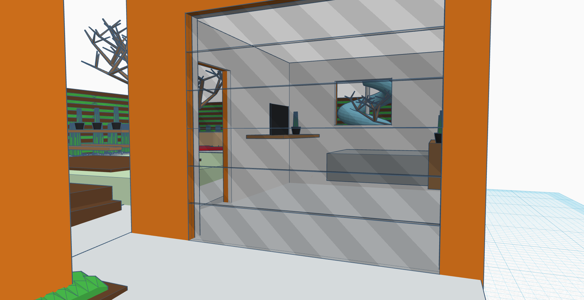
Previous owners were not using the detached single-car garage as intended, and instead used it as a storage room for some workout equipment.
This gave me a great opportunity to clean up the place and turn it into a comfortable guest house which housed a king size bed, a big screen TV and a desk. The garage gate was replaced with frosted glass which still gave guests all the privacy, while allowing for the space to be filled with more natural light. The addition of a stylish entrance gate to the long driveway leading up to it further increased the privacy of guest house residents.
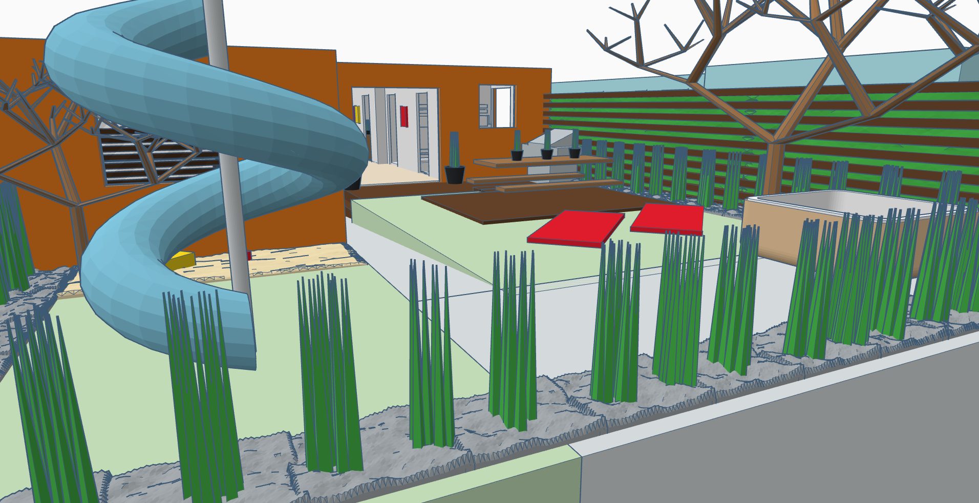
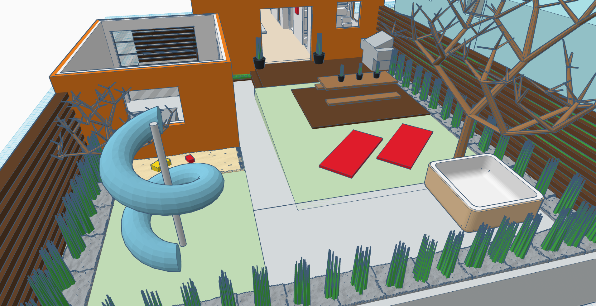
Perhaps the most notable feature of this property which has caught my eye was the backyard. With enough room for the imagination to run wild, I've outfitted it with the most essential items one might desire in the outdoor space.
Tucked in the far corner behind the guest house, and away from the frequent gusts of wind sat the kid's playground. Children could be unleashed outside where they could now spend a better half of the day without being locked indoors.
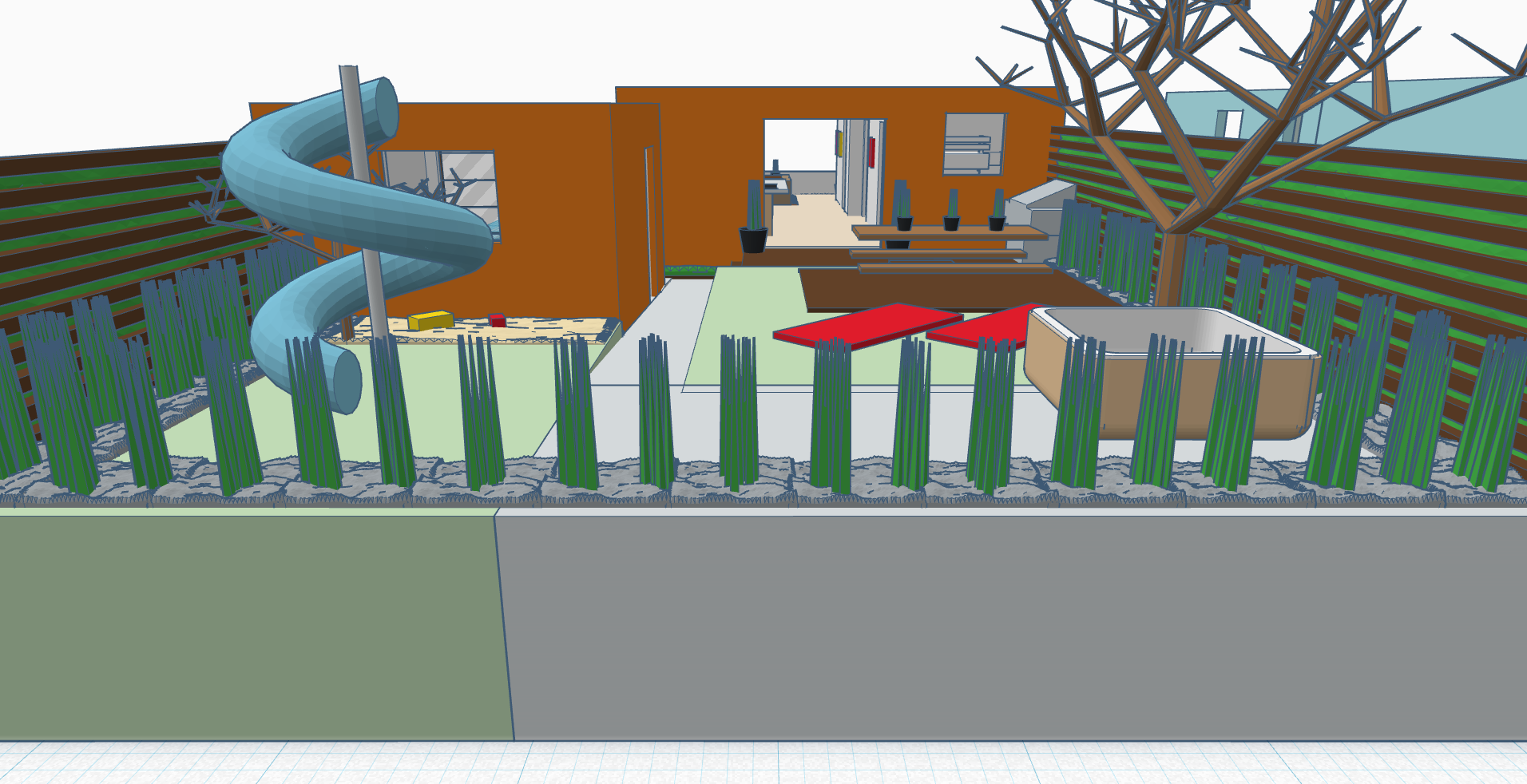
The beautifully aged tree opposing the guest house and the playground provided fantastic cover from hot summer sun and served as fantastic protection from the wind, creating the perfect spot to unwind at the end of the day. This is where the hot tub, along with the outdoor dining area were placed.
Finally, the expansion of the back door and the addition of a porch featuring a full-size BBQ, formed a logical connection between the indoors and outdoors. The porch also eliminated the drop in elevation between the house and the backyard, creating for a more pleasant transition between the two.
As a finishing touch, the house received a great deal of landscaping. Low maintenance plants were specifically selected for this property as they could simply prosper due to the precipitation that the frequent morning fog would bring. The outside was also brought inside with the introduction of several large house plants and smaller succulents sprinkled throughout the house, for plants breathe life into any empty space.
A simple, thoughtful remodel done on a budget!
![]()
Enjoyed what you saw? Stay updated by following me.